Case Study
Boone Smashes
Brand identity and weekly graphics for Boone Smashes, a weekly Smash tournament series.
The Problem
Boone Smashes had become stagnant, with no clear direction for the future. The series needed a revamp to draw in new and out-of-region players, and to give them a reason to keep coming back.
The Process
- Rebuilt the brand identity. Partnered with the tournament organizers and artists to create one consistent brand identity, so every post, stream and sponsor conversation read as the same professional organization.
- Put structure around the calendar. Weekly and monthly infographics told new and returning players when and where events were happening, turning dispersed announcements into an organized schedule.
- Built competition into the content. Placement graphics, Players of the Month and seasonal power rankings gave players visible recognition, a reason to return, compete and bring others.
Previous designs
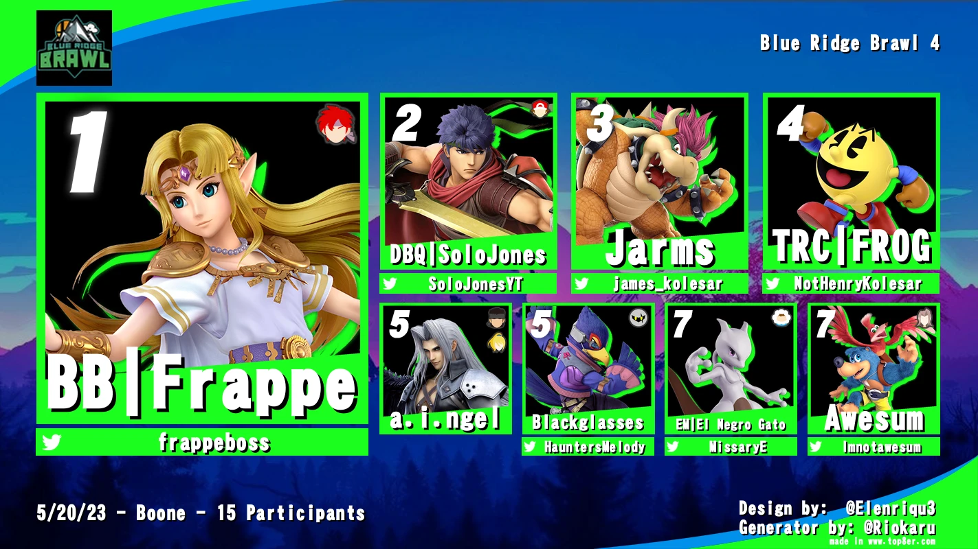
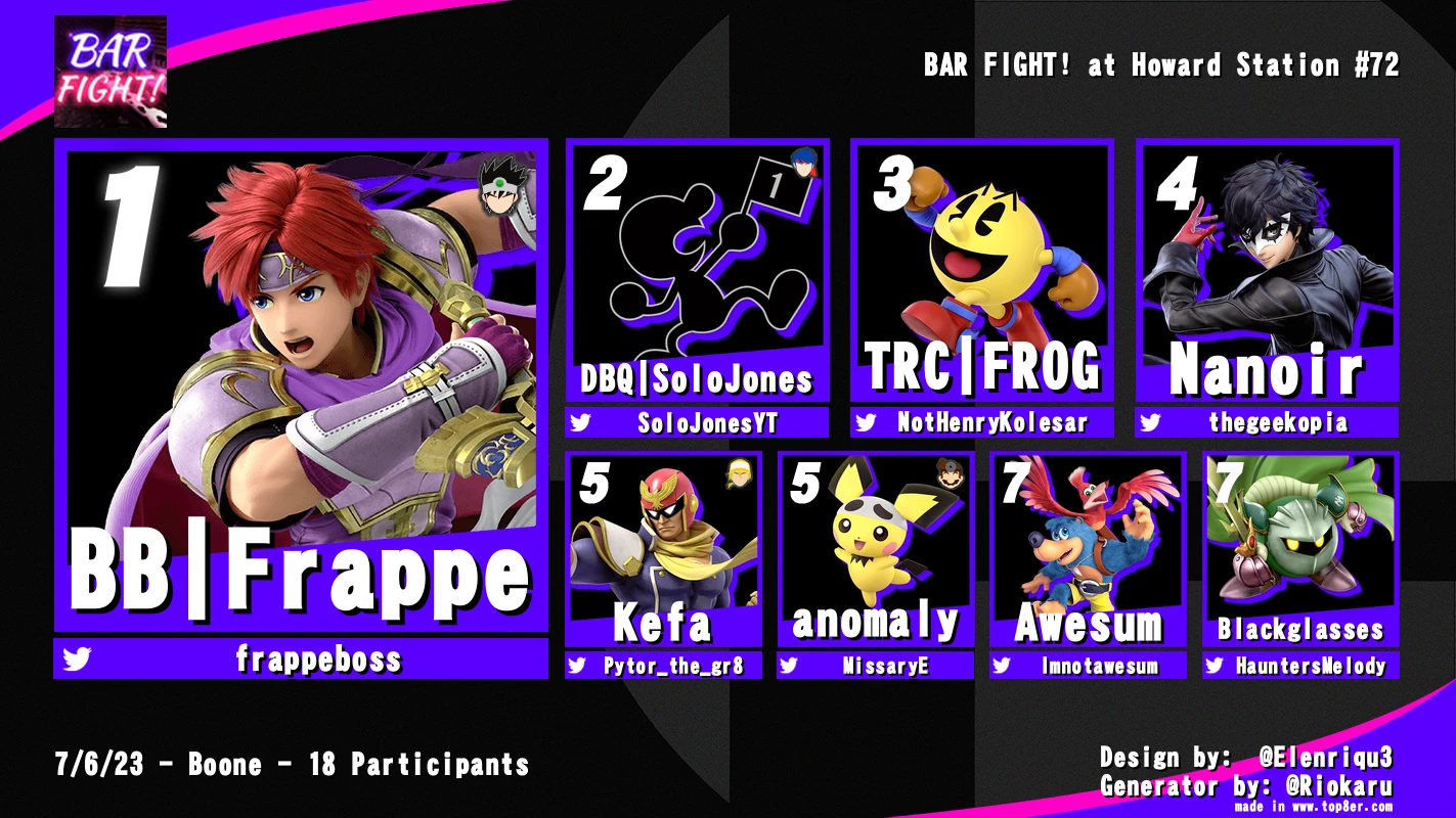
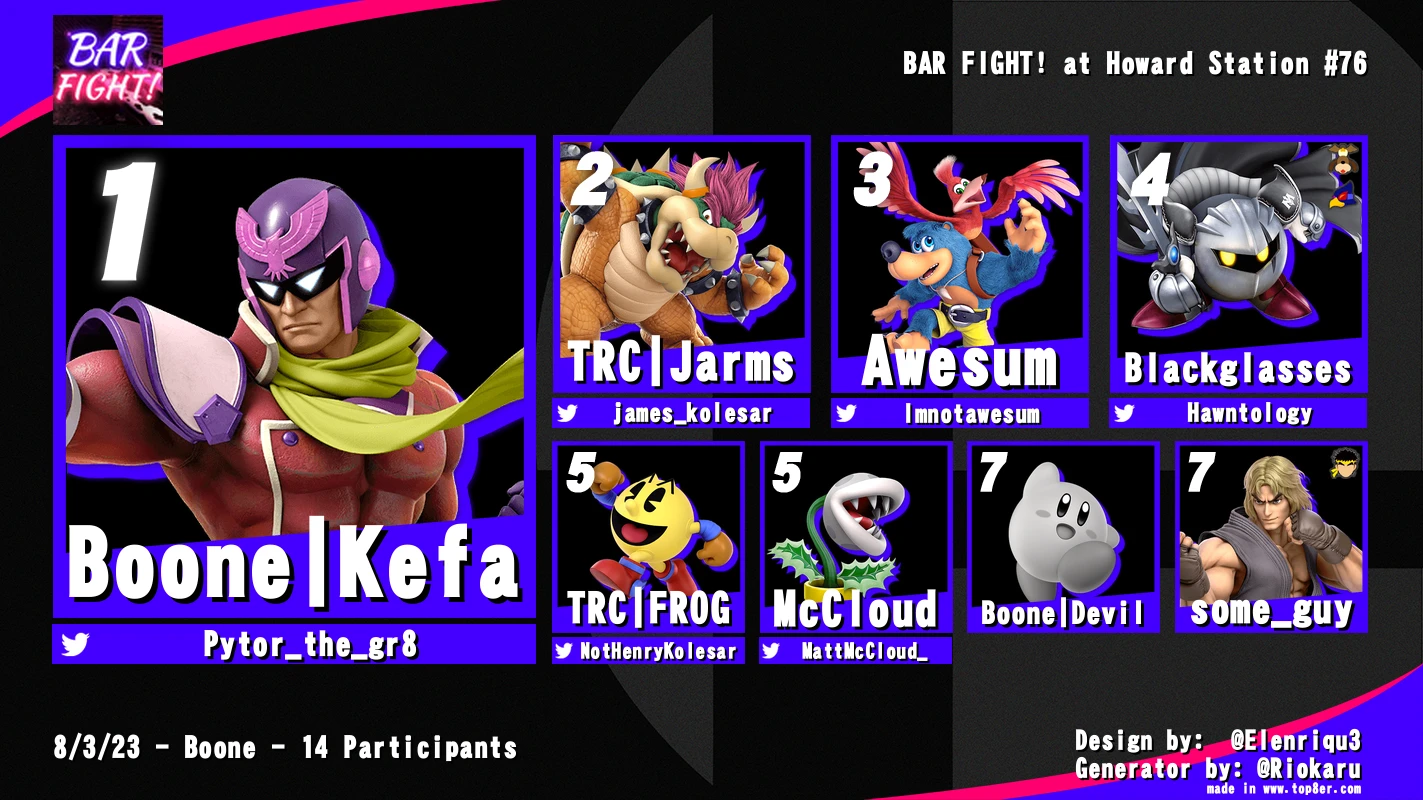
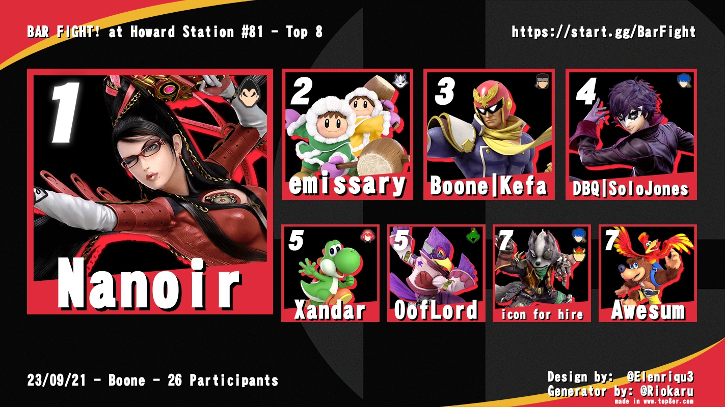
The previous top 8 graphics lacked differentiation from other scenes. To stand out, every release needed to be more custom.
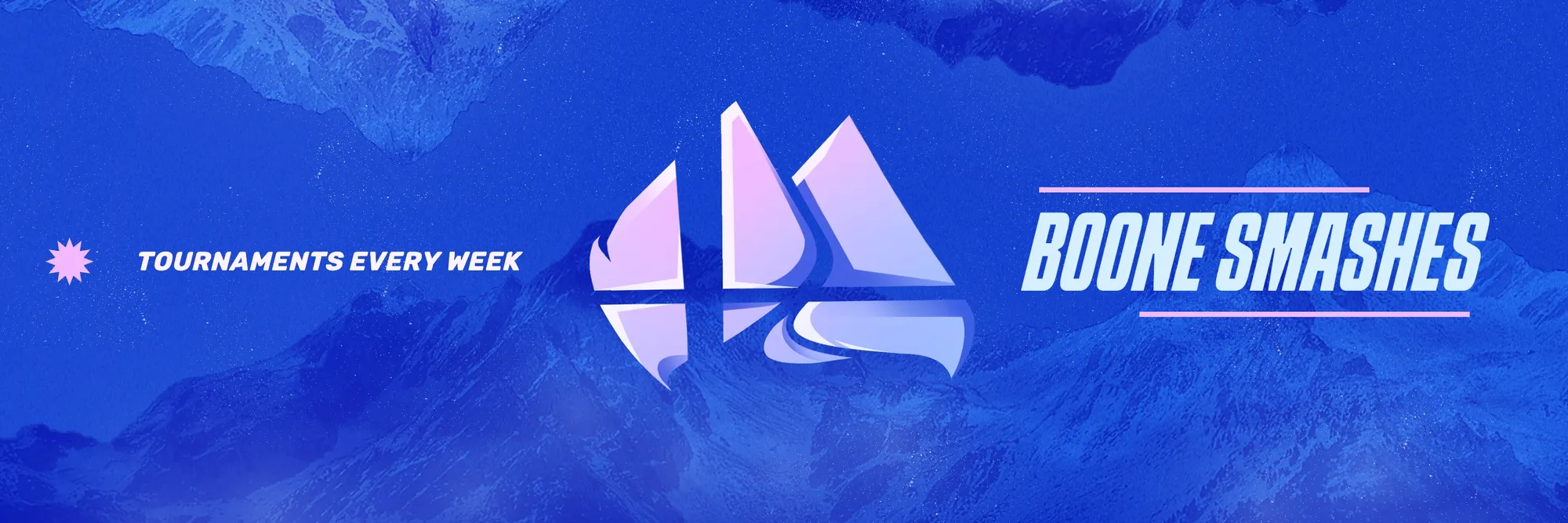
Revamped brand identity
infographics
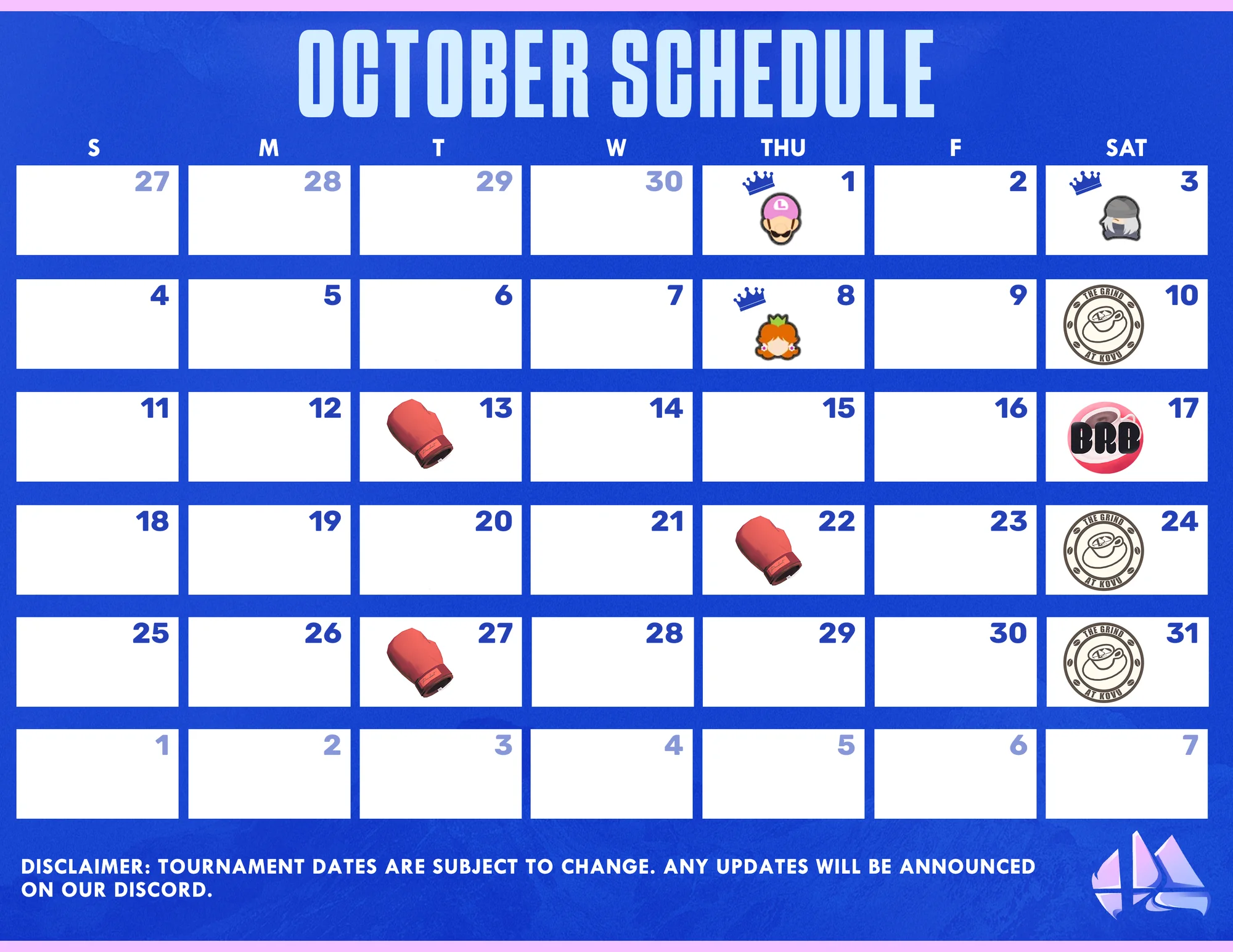
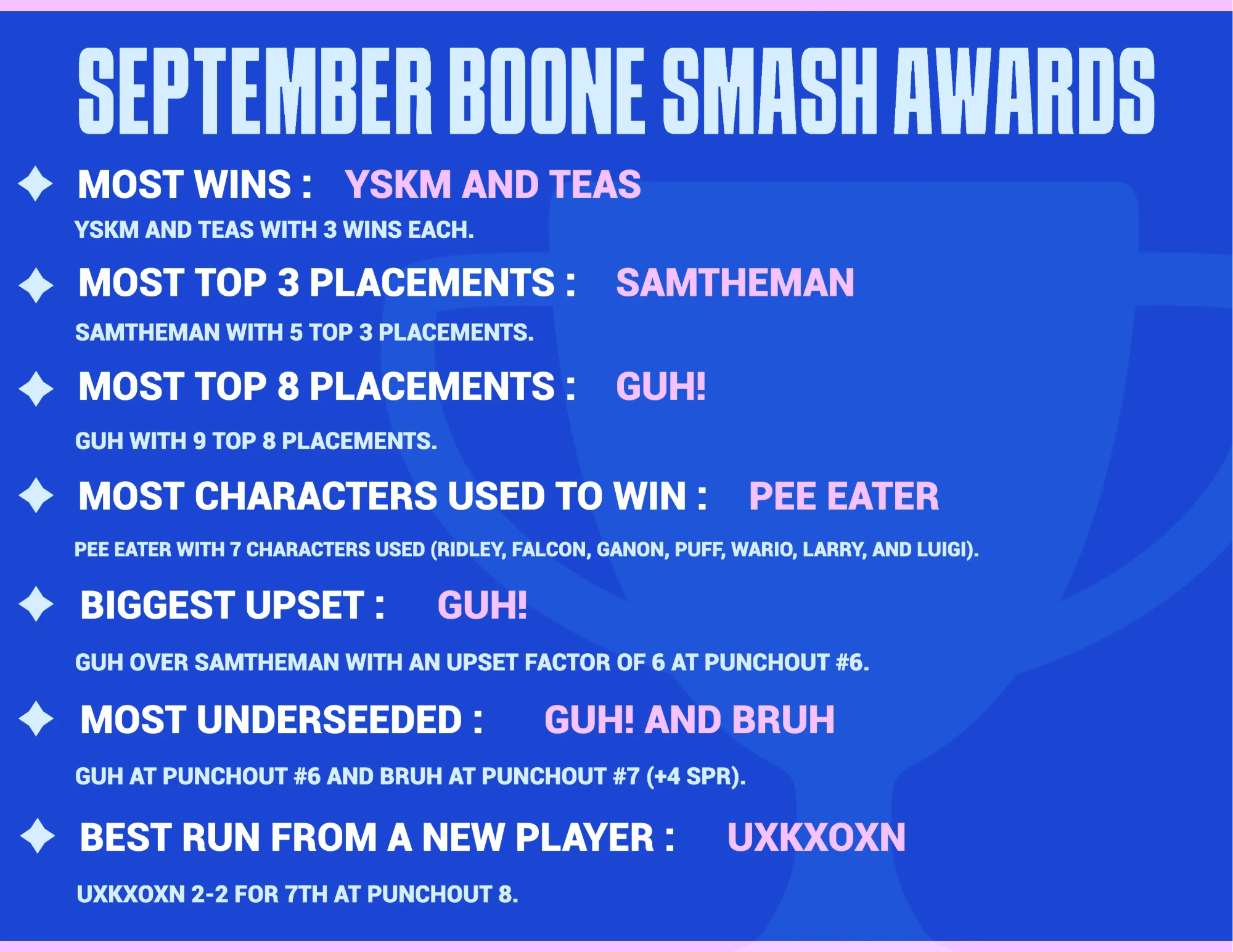
Produced infographics on a weekly and monthly basis so new and returning players could find tournaments and know when they were happening. Players of the Month recognition added a competitive hook, so players would keep coming back. 2-3 Infographics Per-Month.
Power rankings
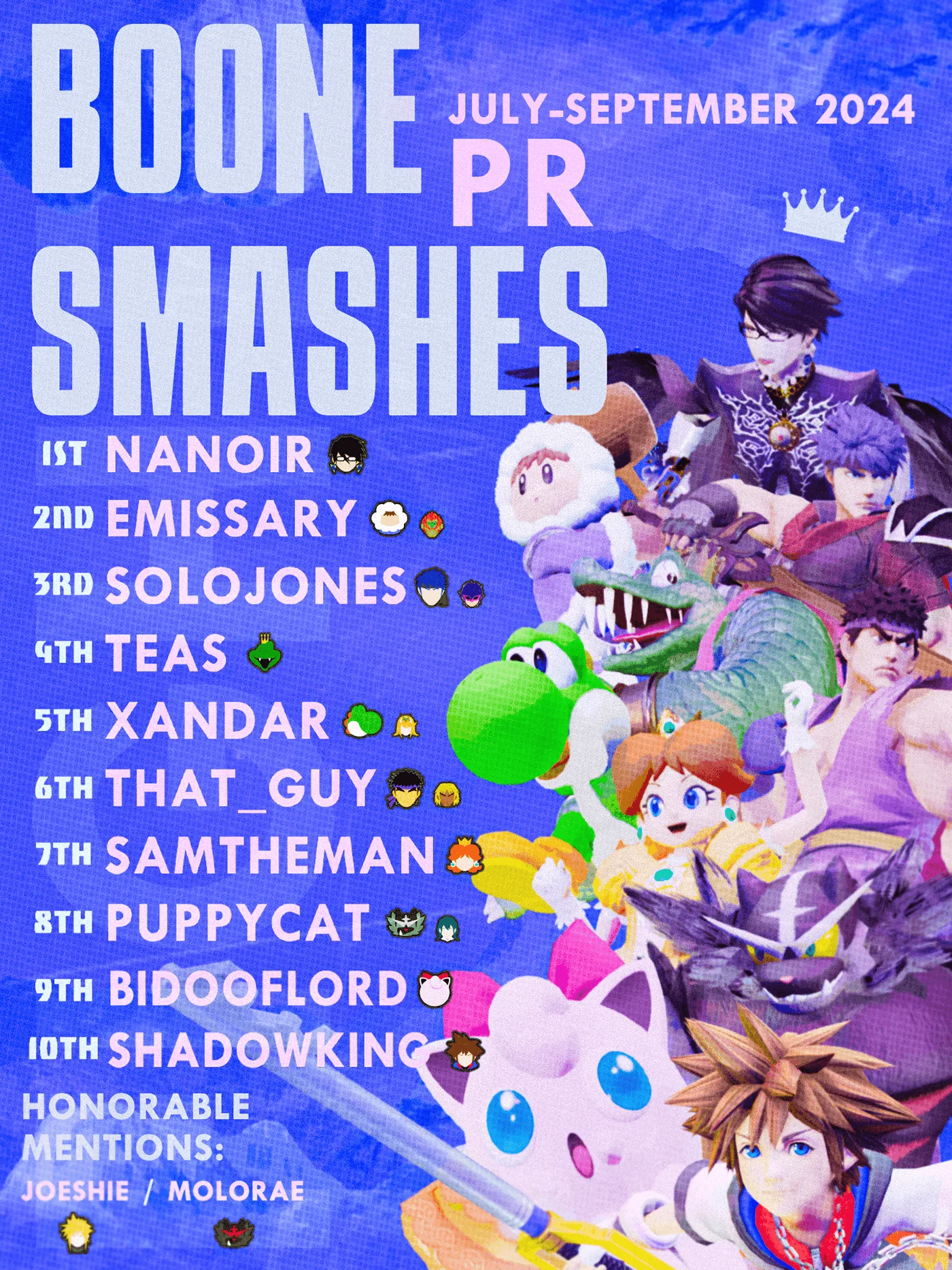
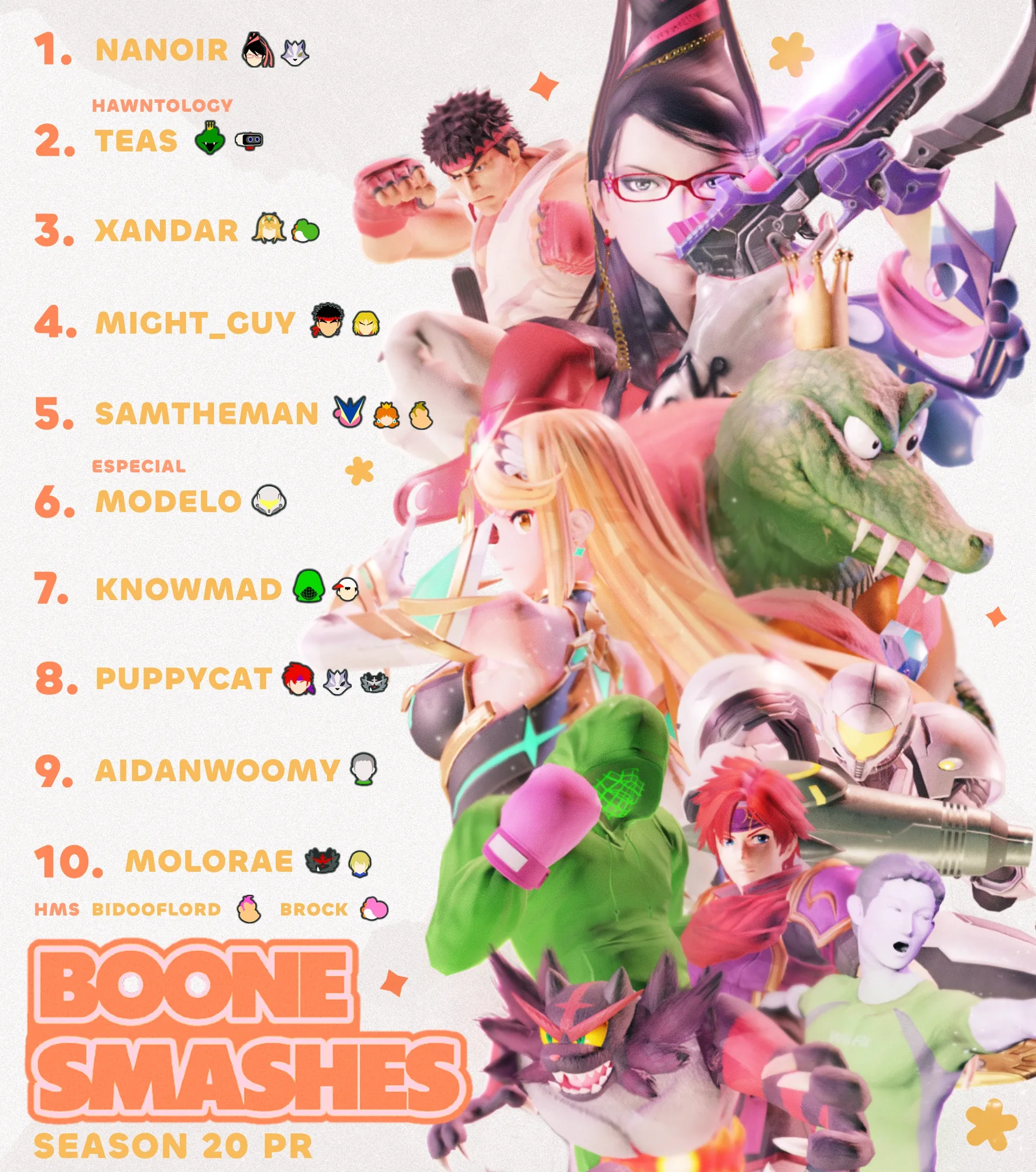
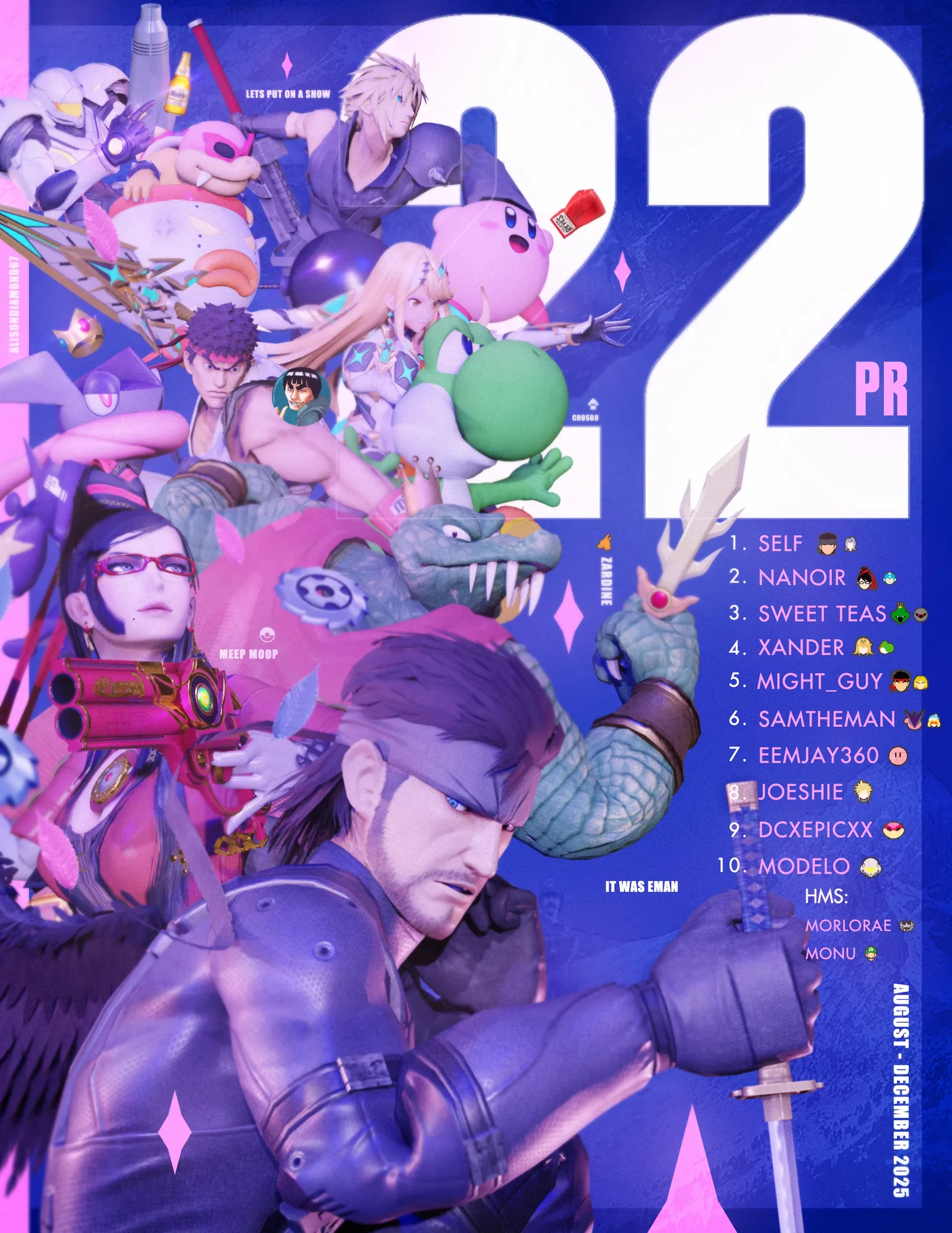
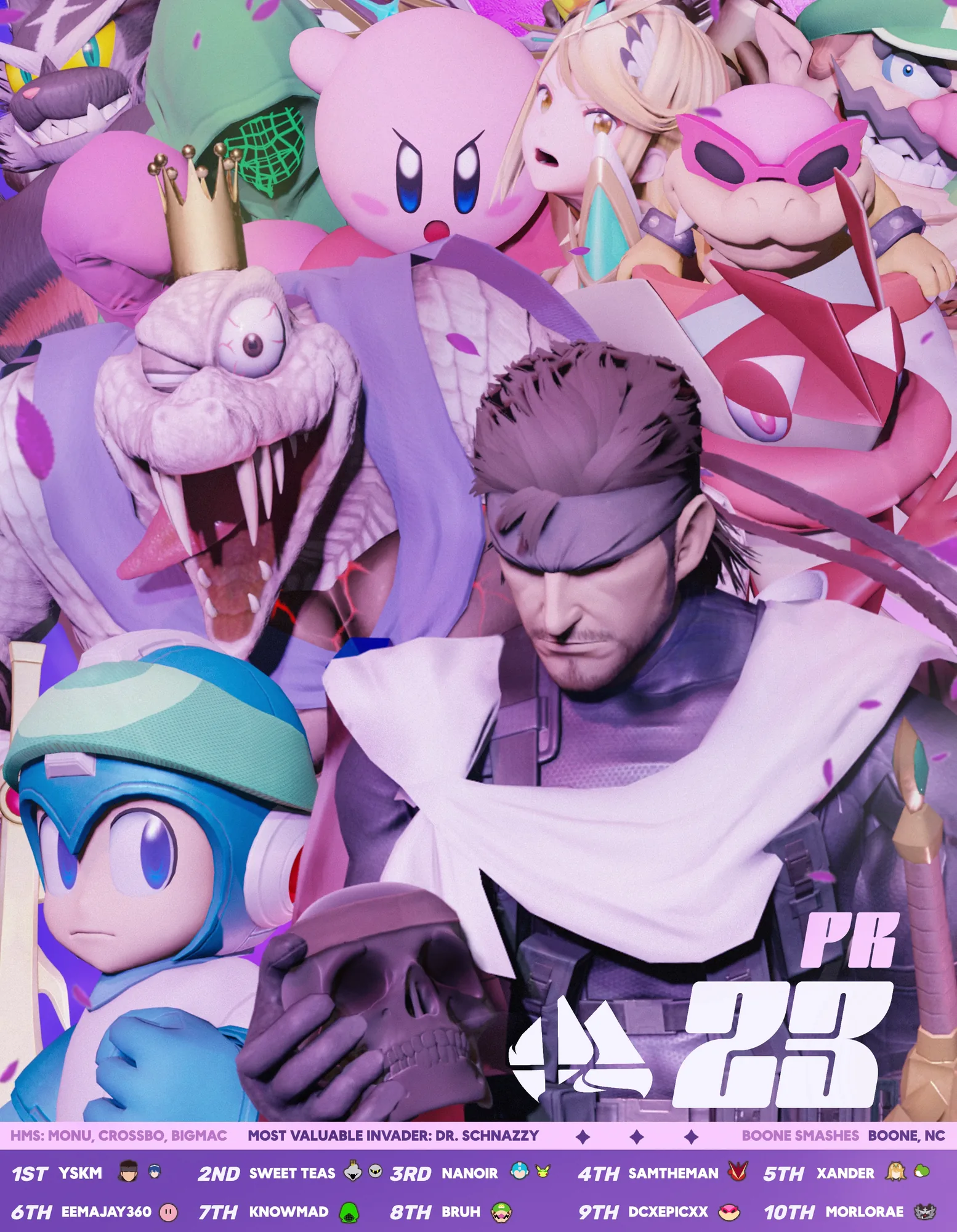
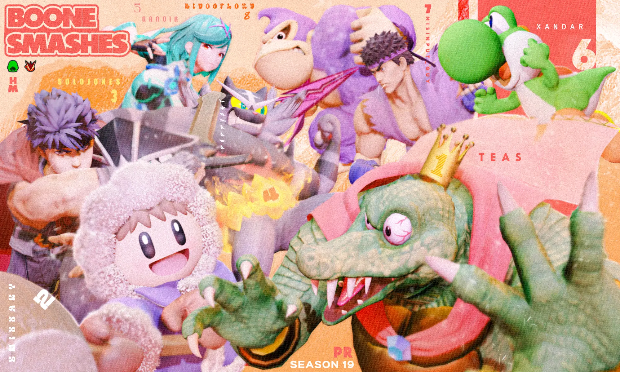
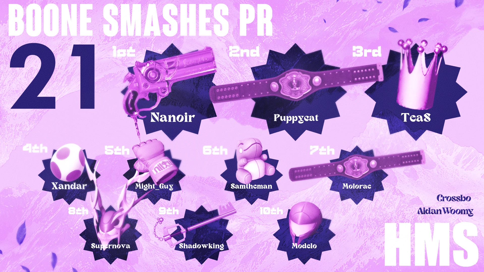
Designed custom graphics for the top 10 players of each season, 8 seasons to date. Public recognition gave players a visible goal to reach, which supported attendance and gave the scene a stronger reward system.
Bar Fight and Bar Room Blitz at Howard Station
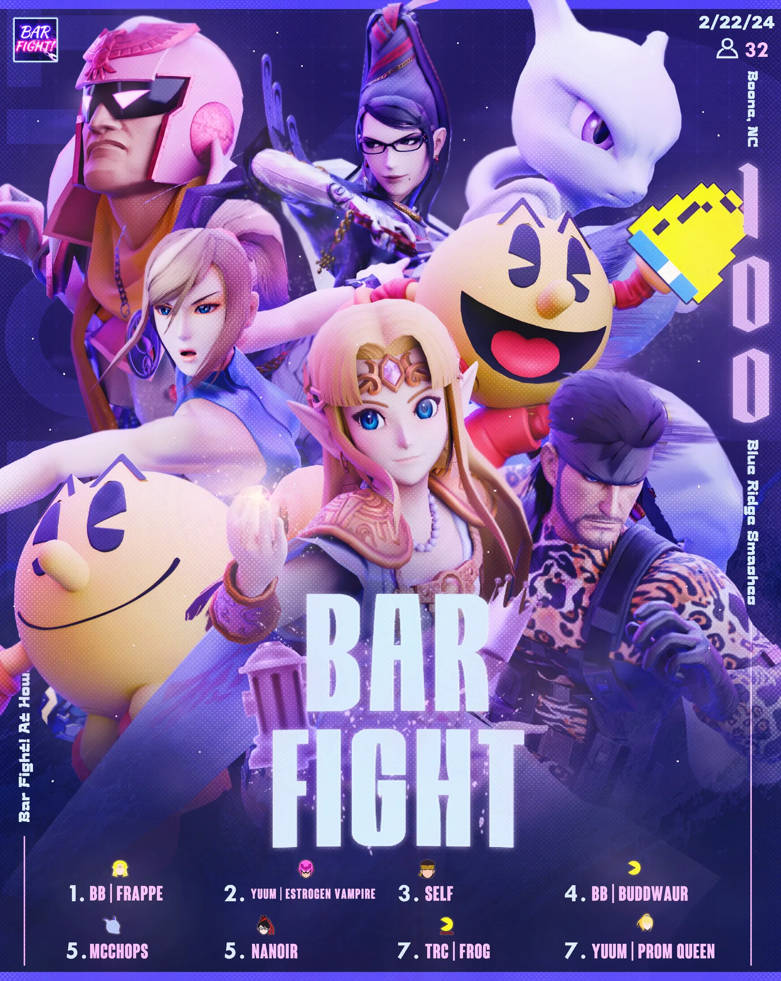
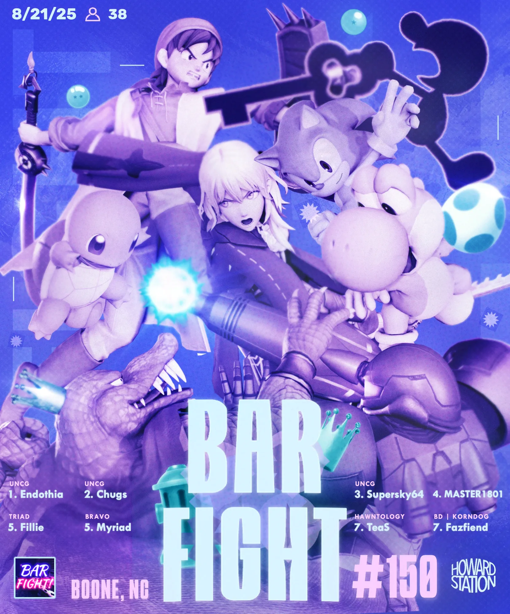
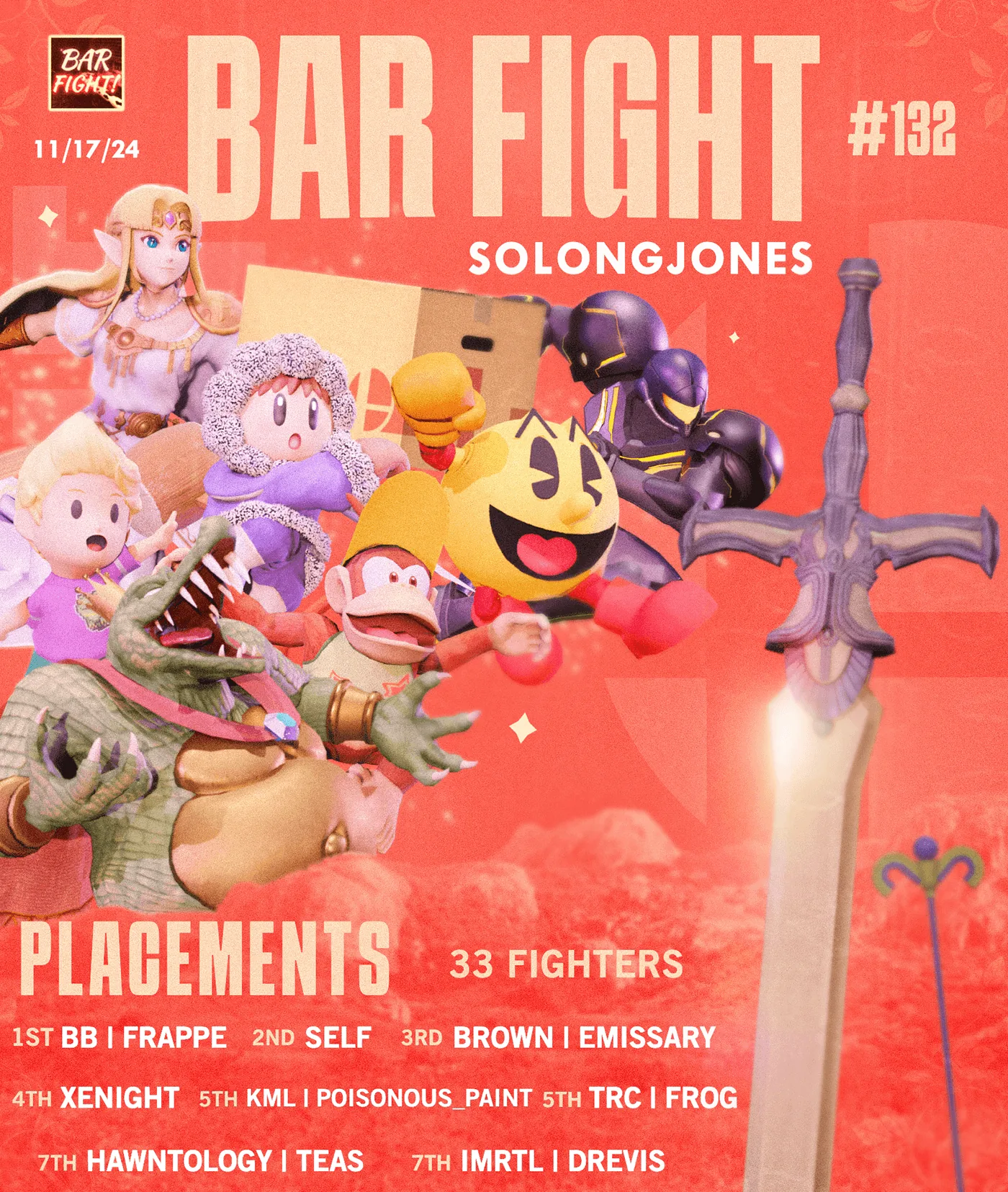
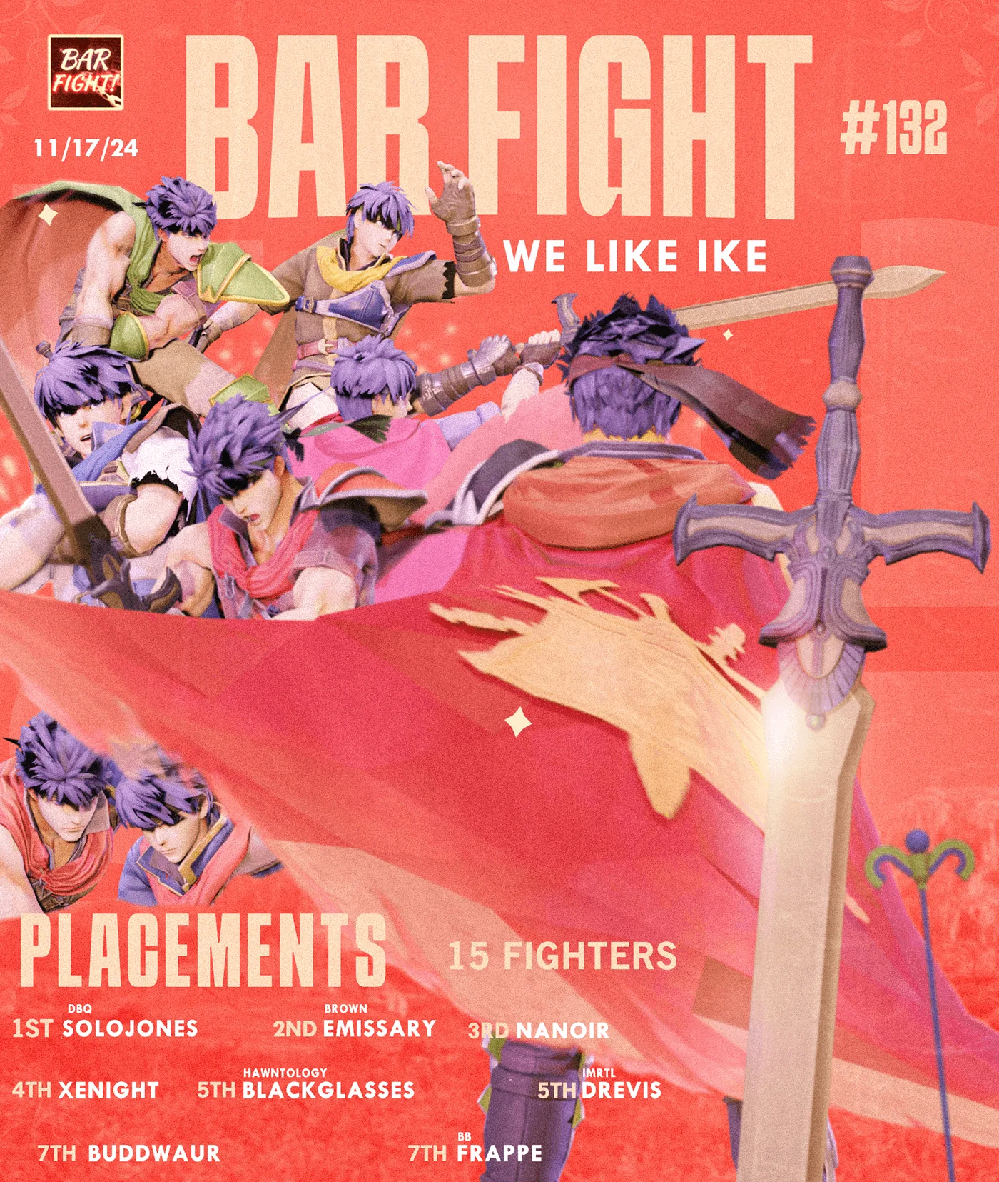
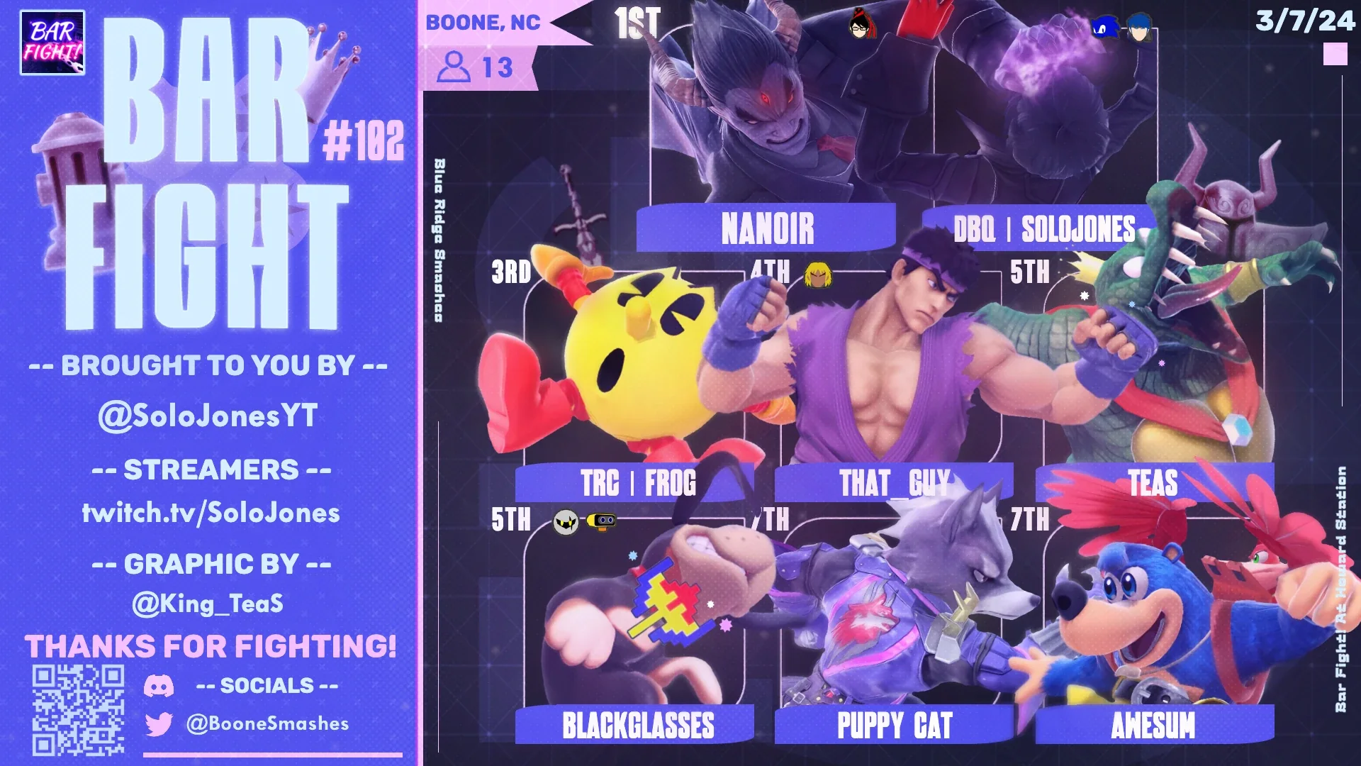
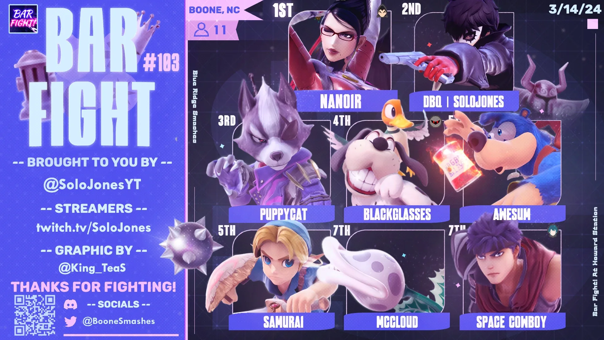
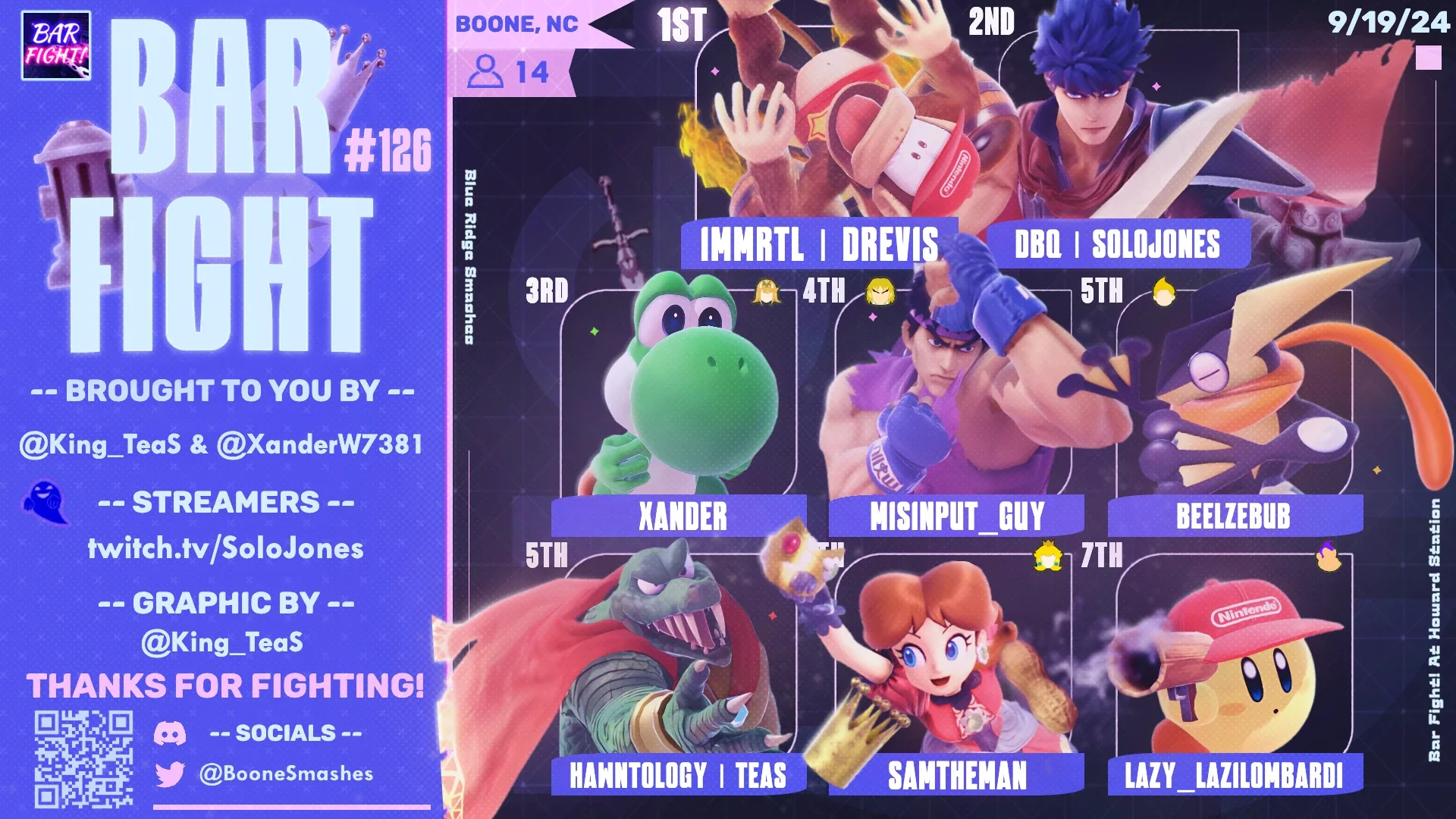
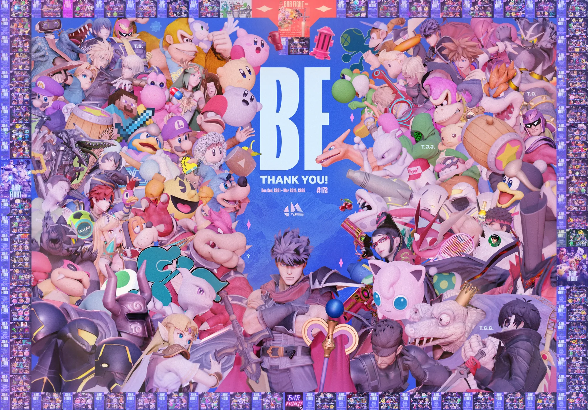
Redesigned the weekly top 8 results graphics and built a templated design system used for 70+ events. Templates kept every release consistent and cut production time to a 2-3 day turnaround time.
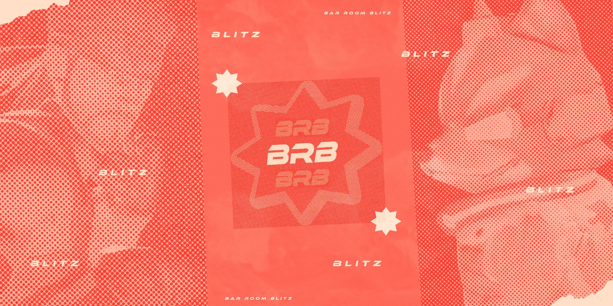
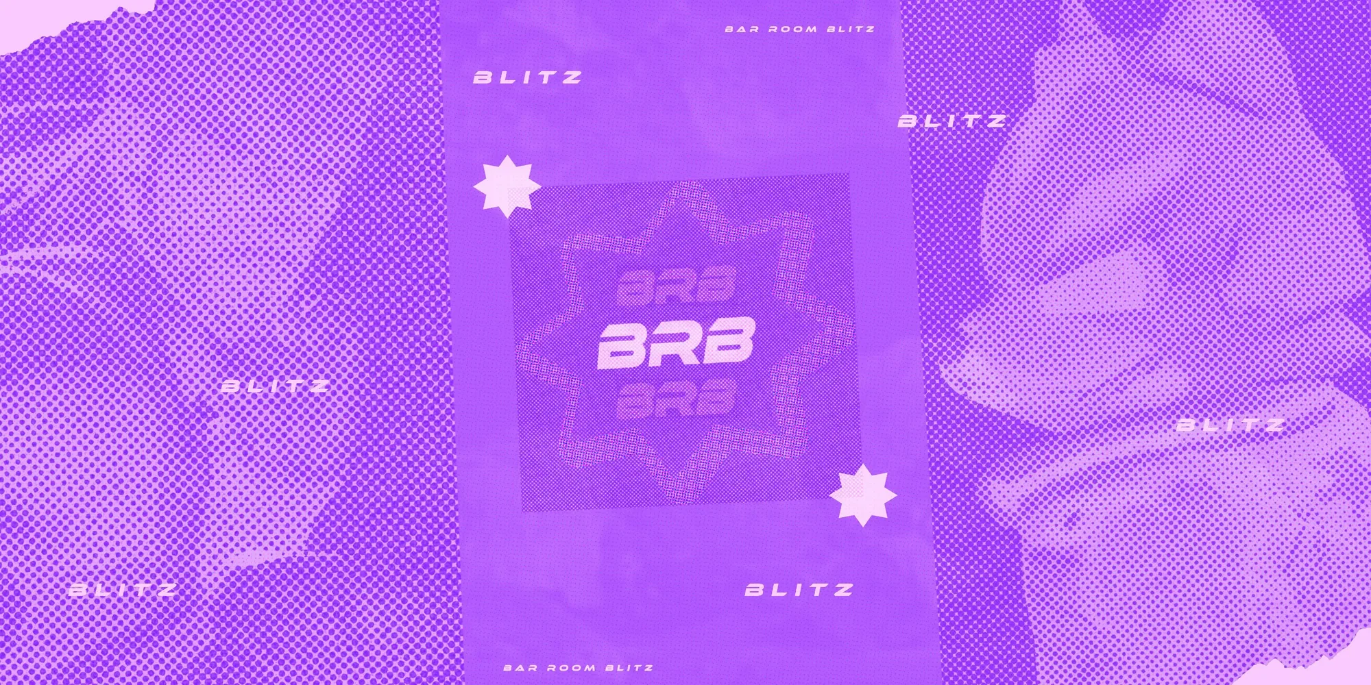
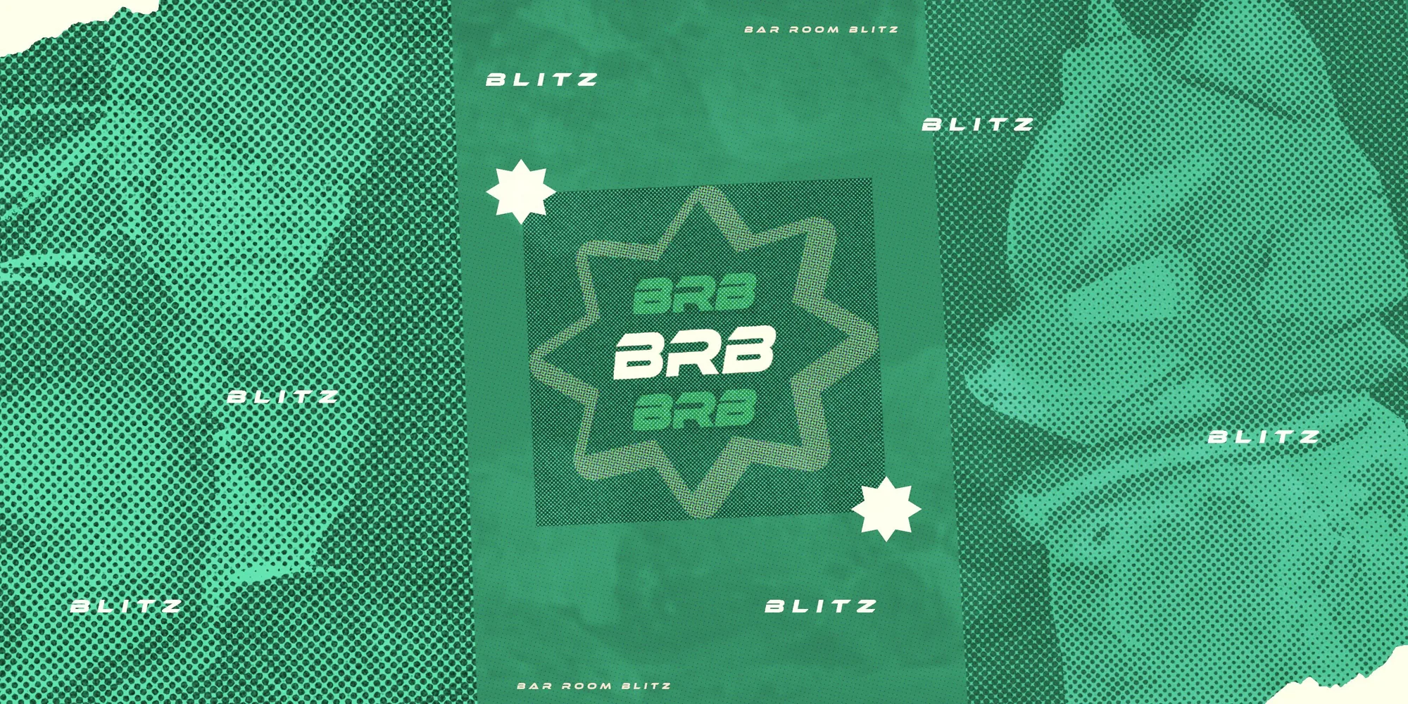
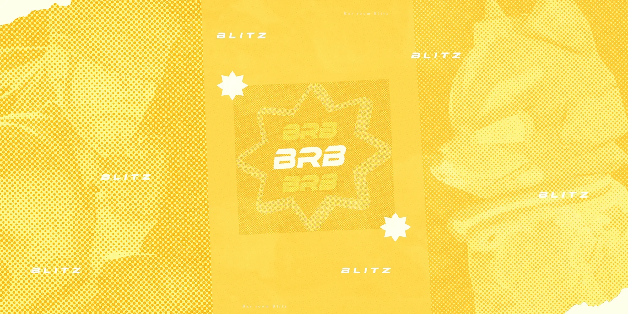
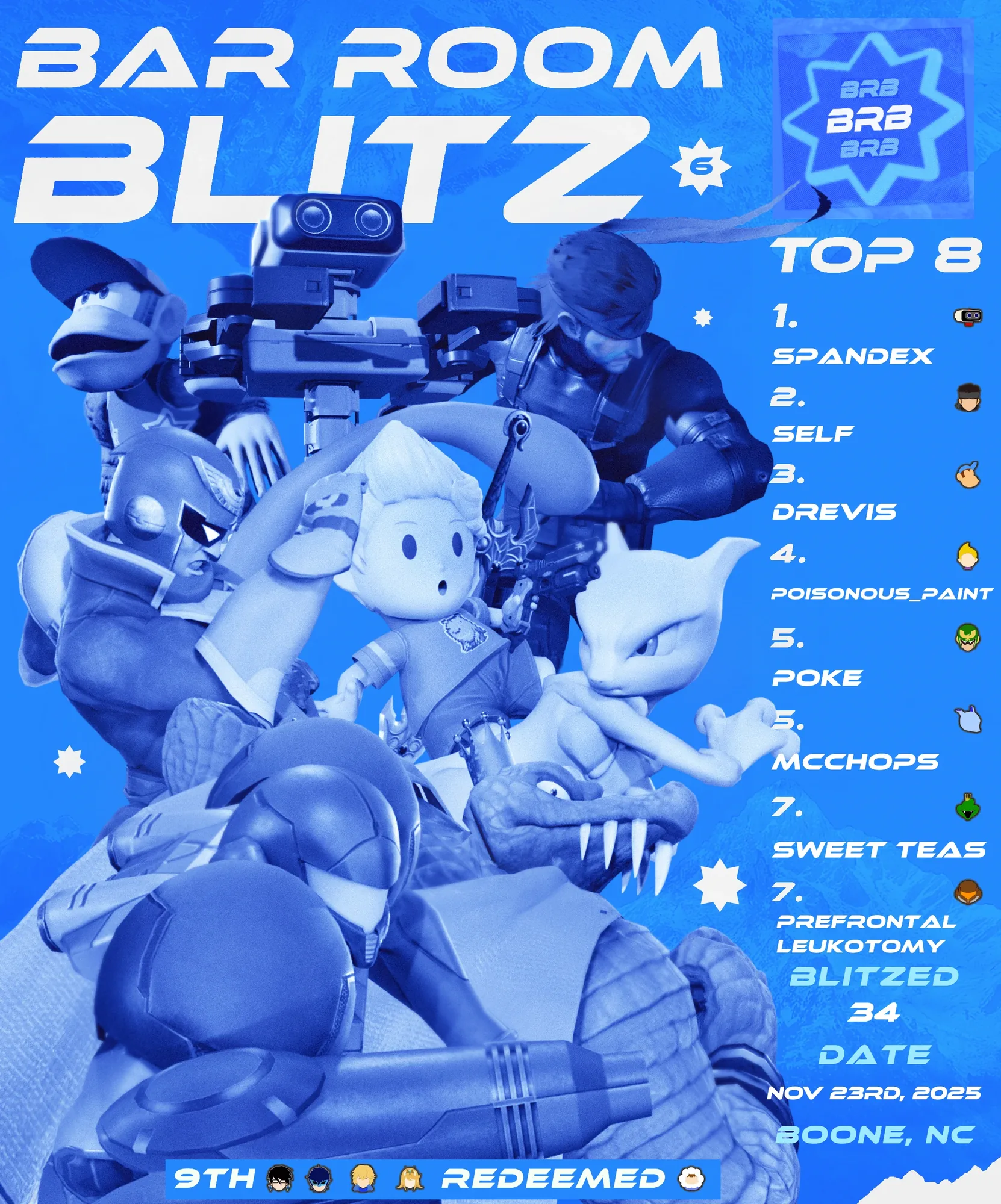
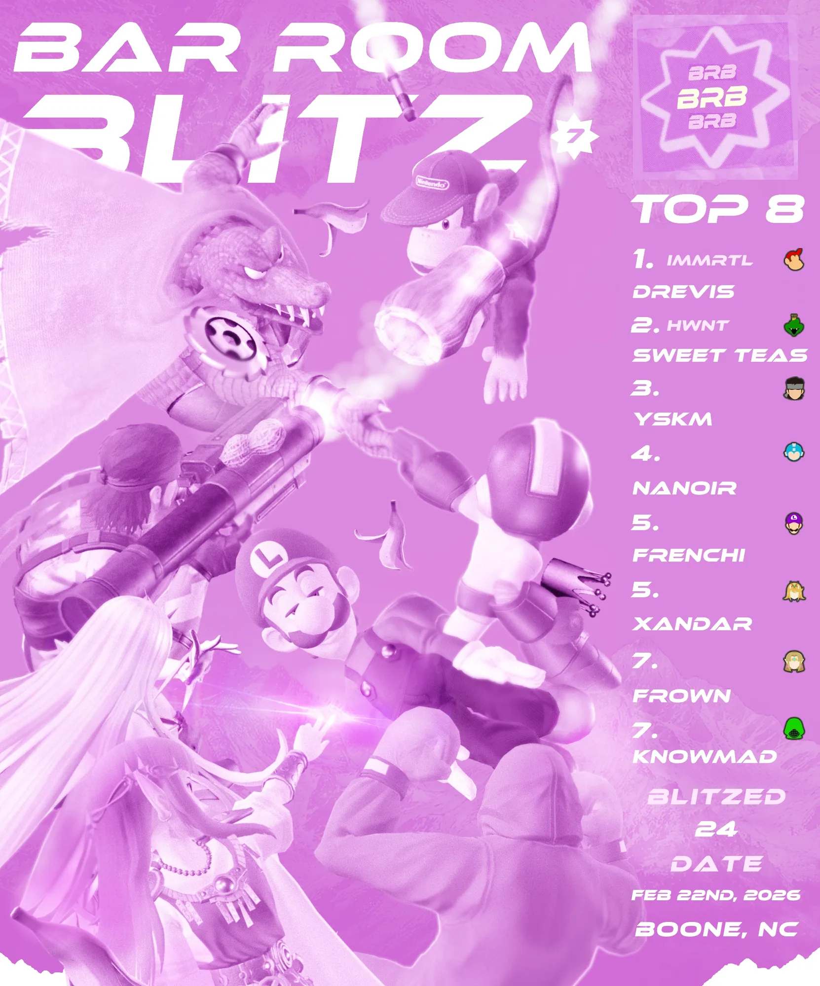
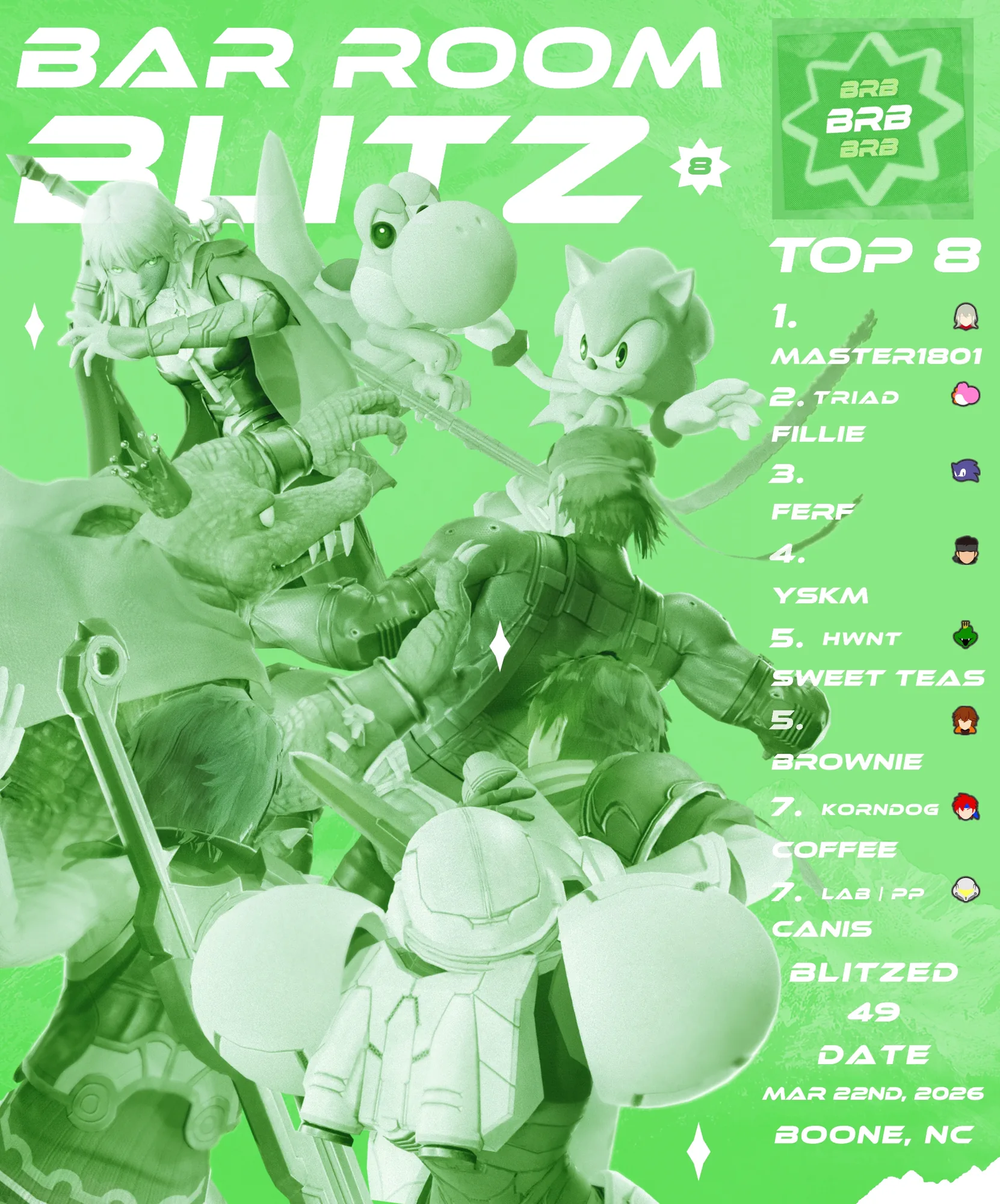
Extended the Howard Station event program with Bar Room Blitz, a second series with its own branding and visual system. Each release used one layout in a different color, so players recognized the series at a glance while every event still had its own identity. Events averaged 30+ players, and many came from out of town, including Johnson City, Rock Hill, Raleigh, Charlotte, Asheville, and more.
The Grind and Bitter Roast Bash at Kovu’s Coffee ↗
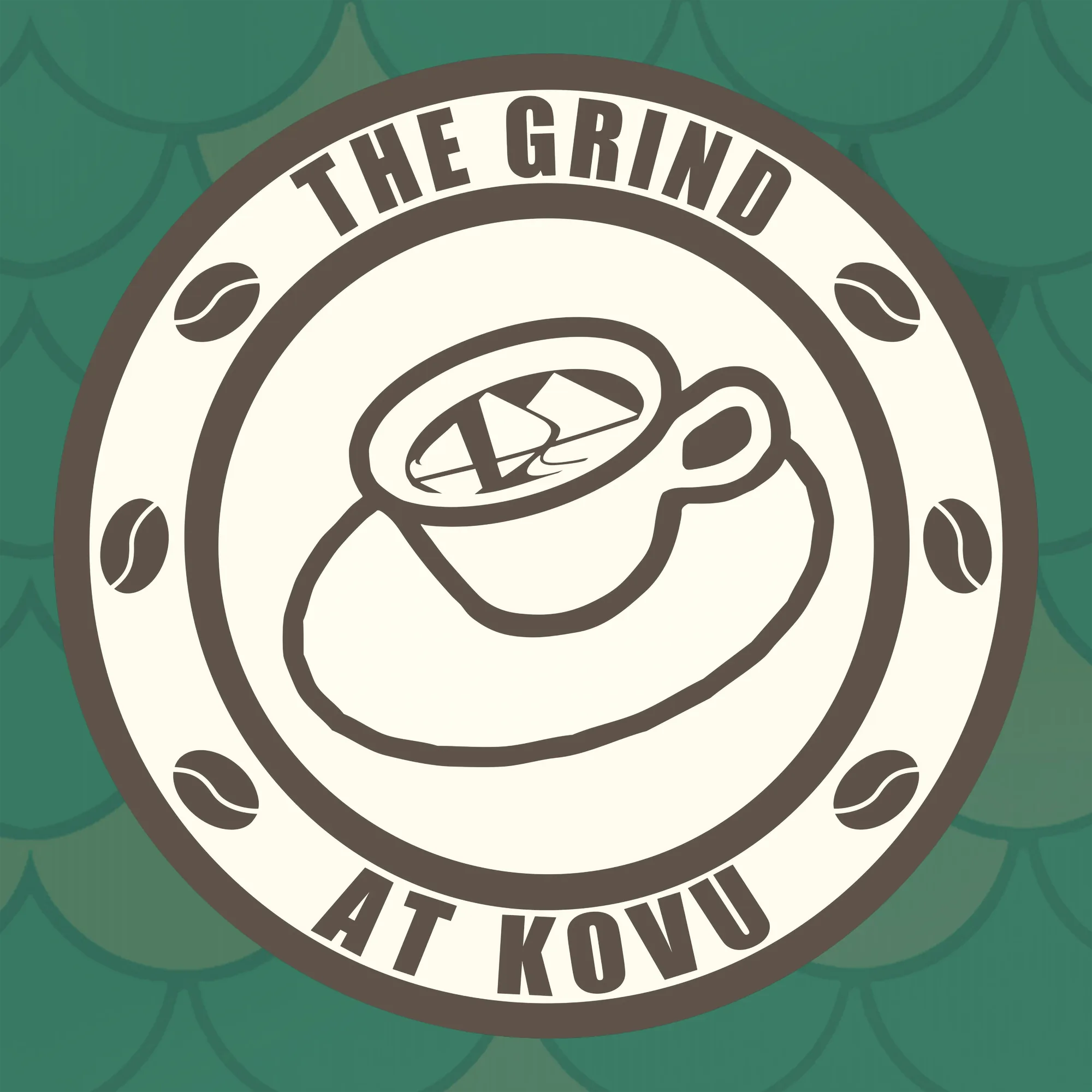
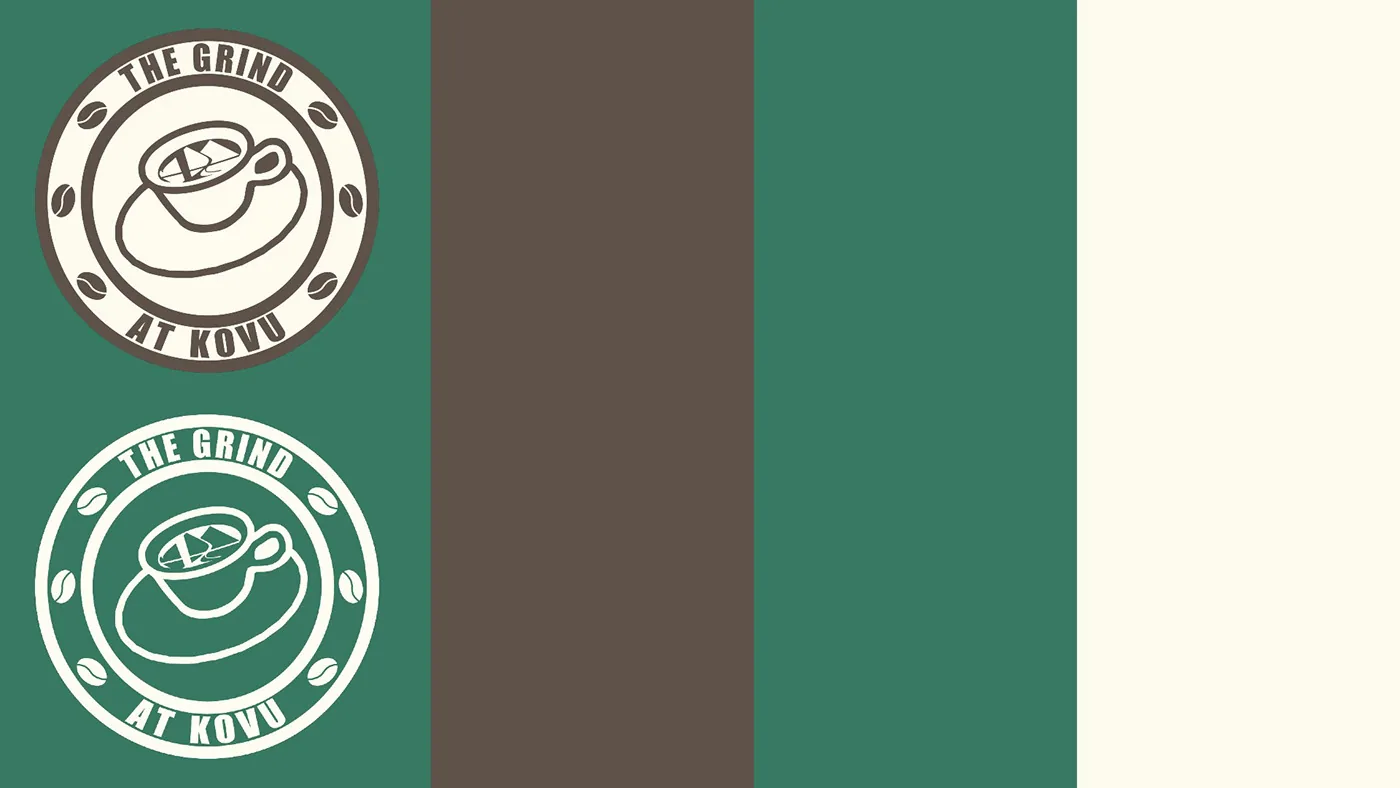
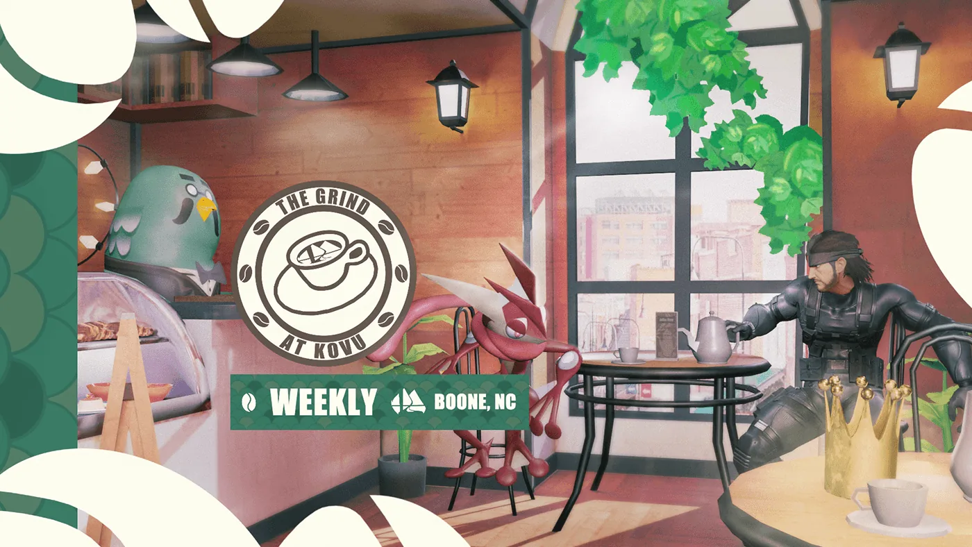
Built the full identity for The Grind, a recurring series at Kovu’s Coffee, from the logo and banner to the stream and VOD assets, so the series looked polished both in person and online.
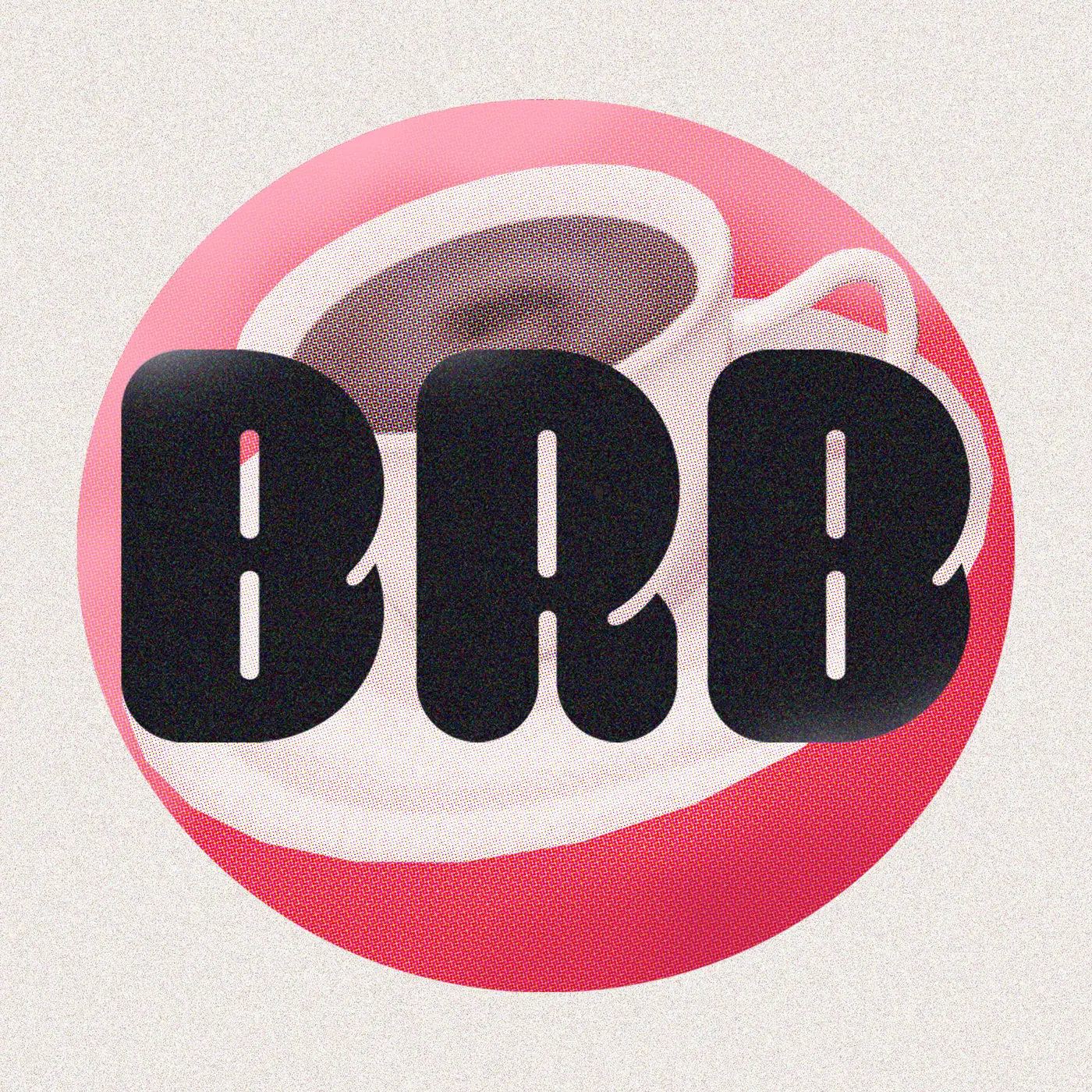
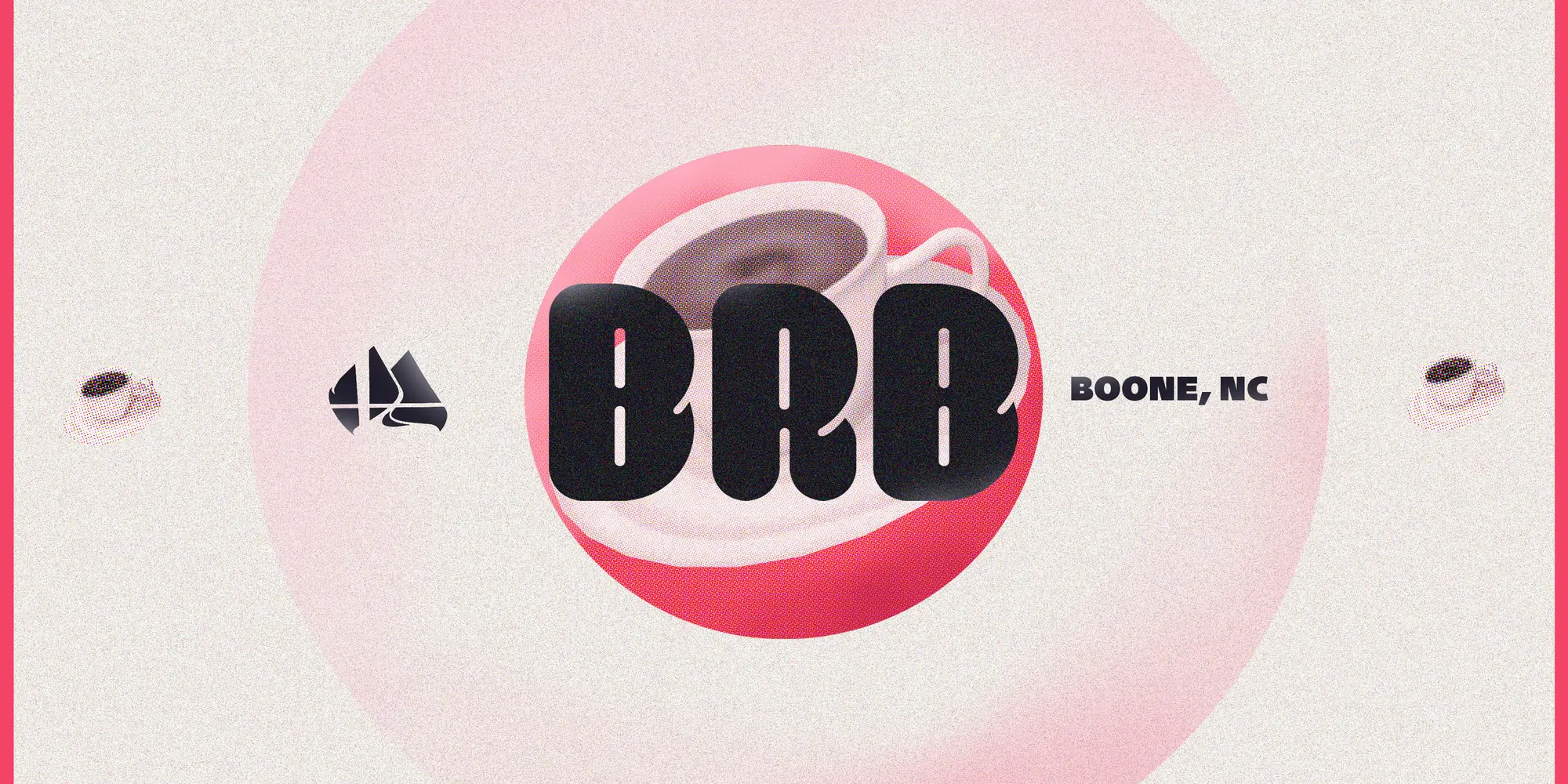
Created the identity for Bitter Roast Bash, the monthly tournament with Kovu’s Coffee: a bold BRB logo built around a coffee-cup with a matching banner.
On-Campus and Special events
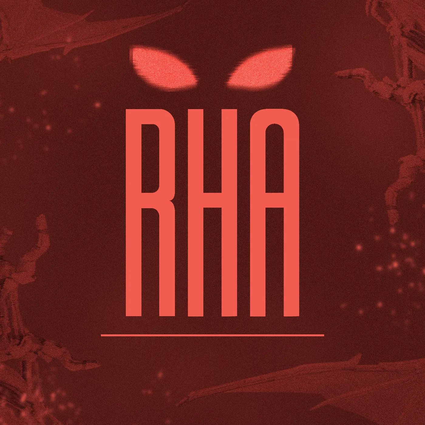
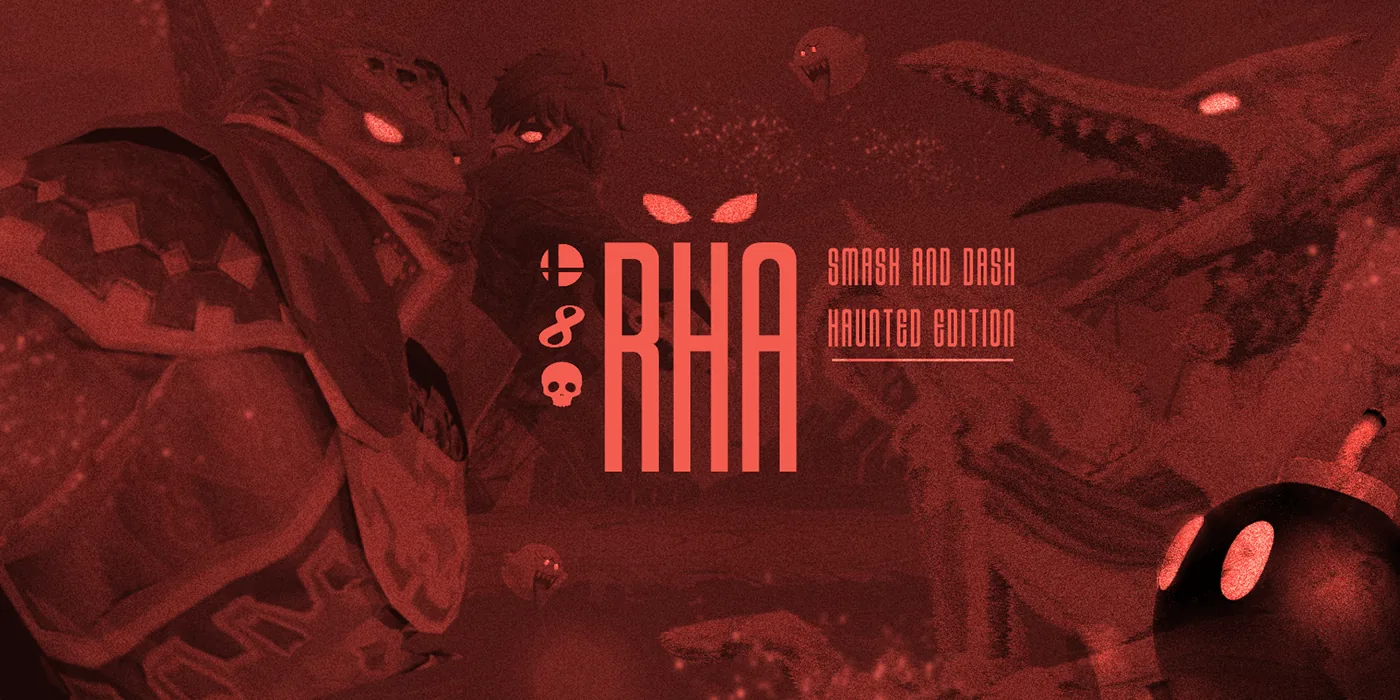
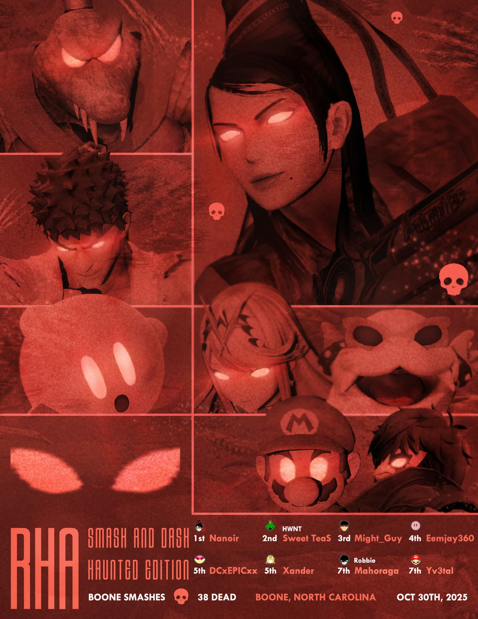
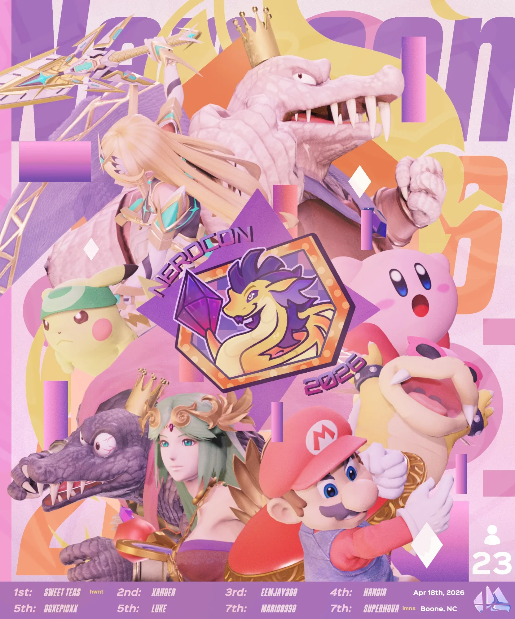
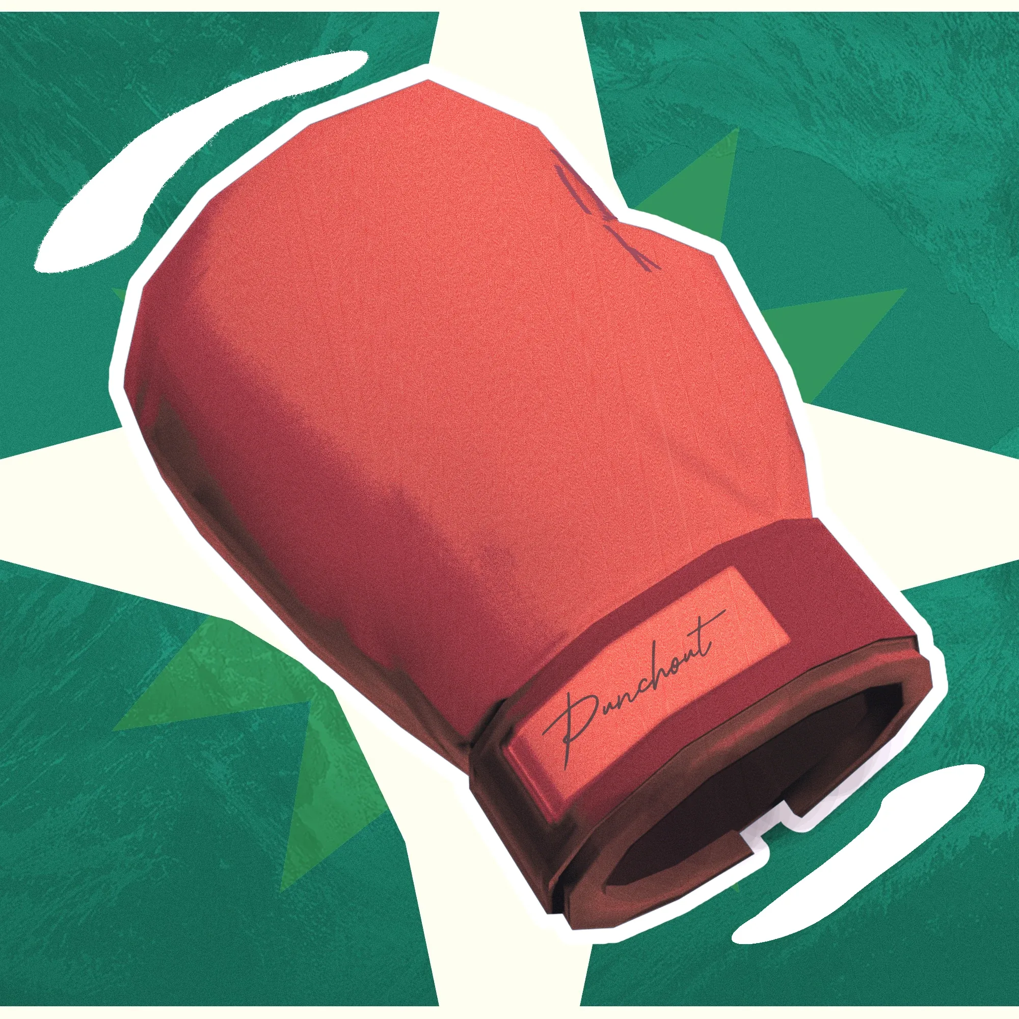
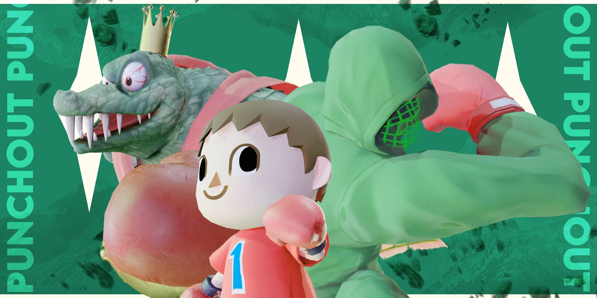
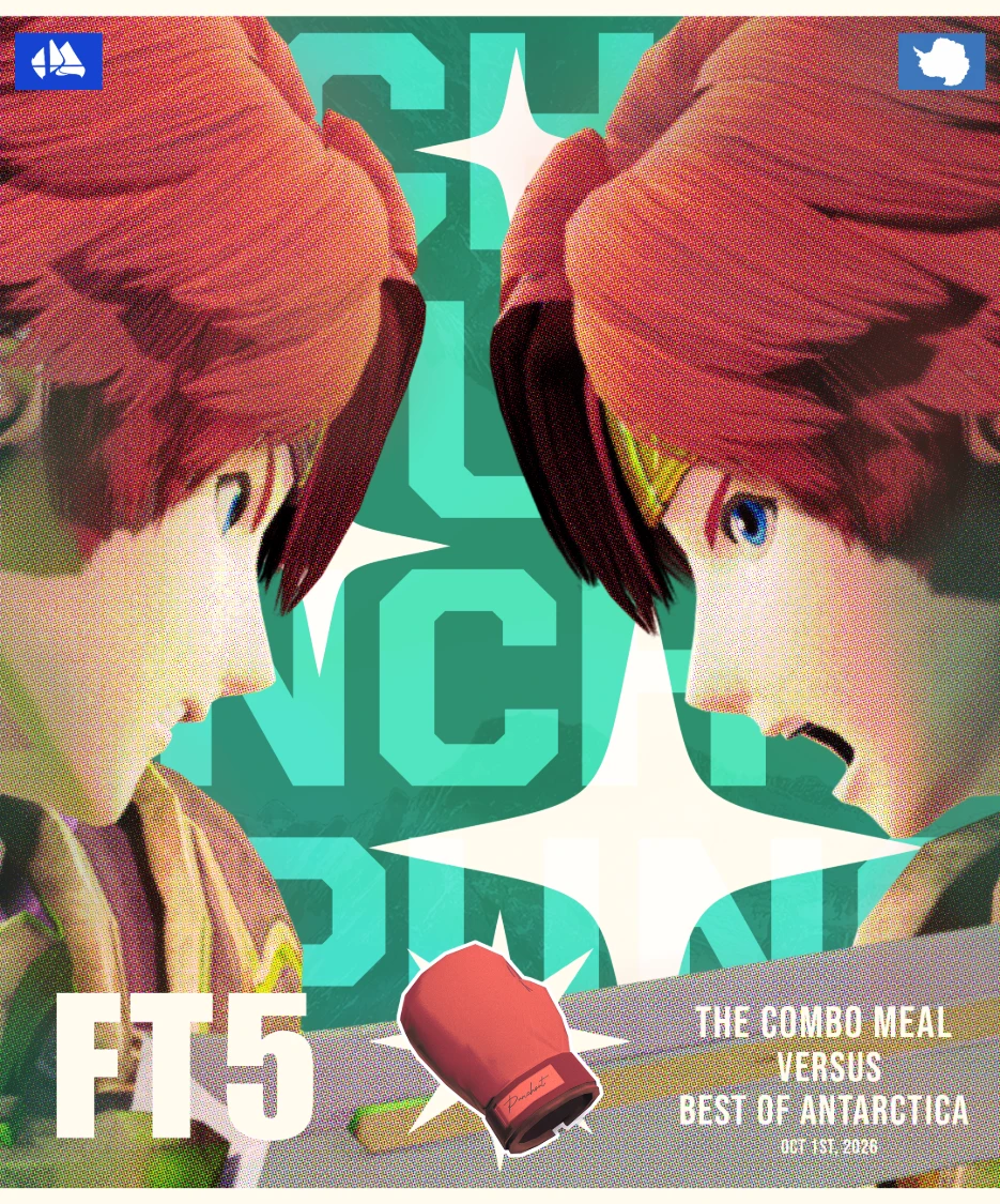
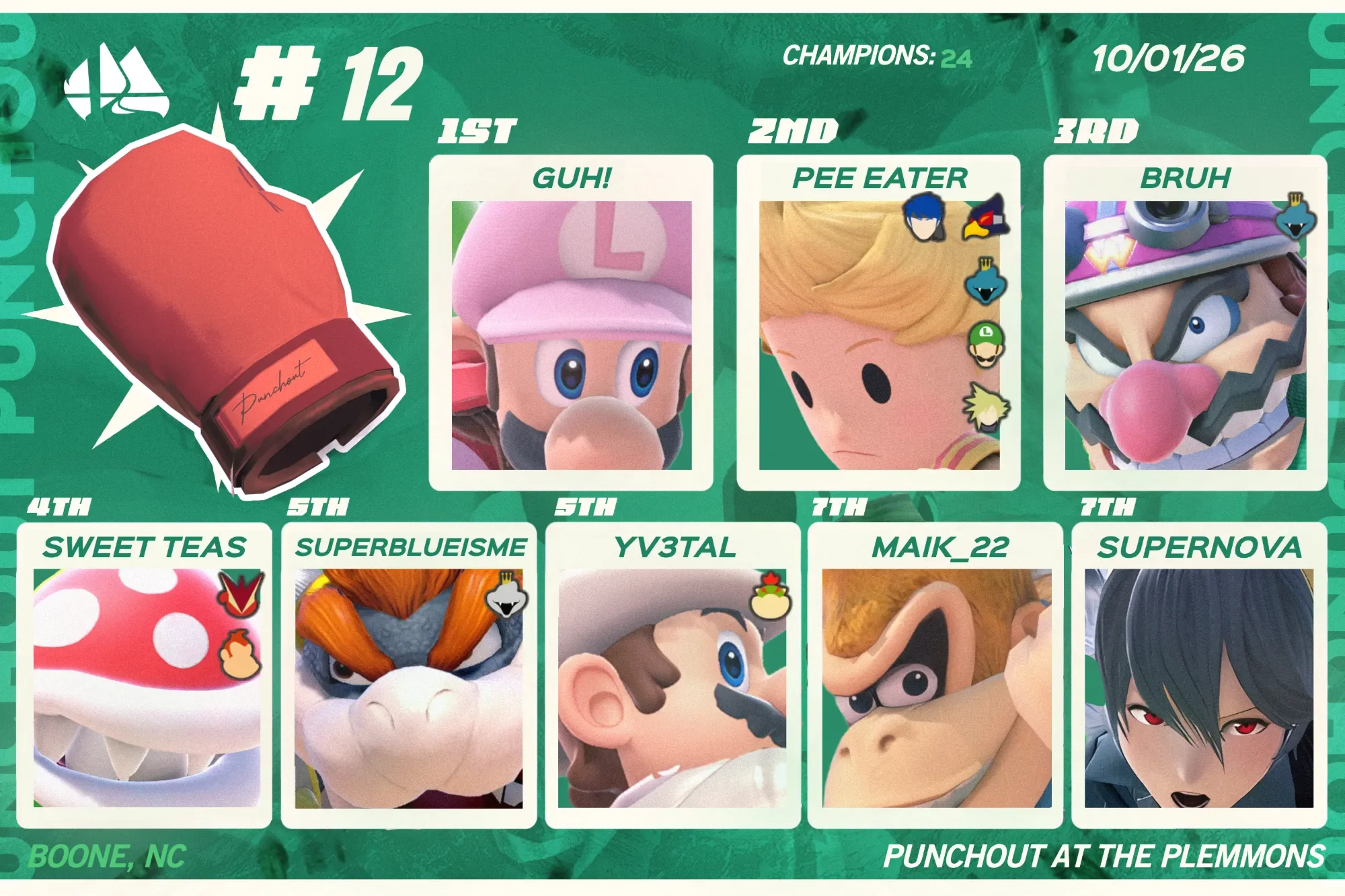
Designed the branding and promotional graphics for RHA and Punch-Out, two on-campus events. Each got its own brand design, so the events could be recognized quickly by a new student-audience.
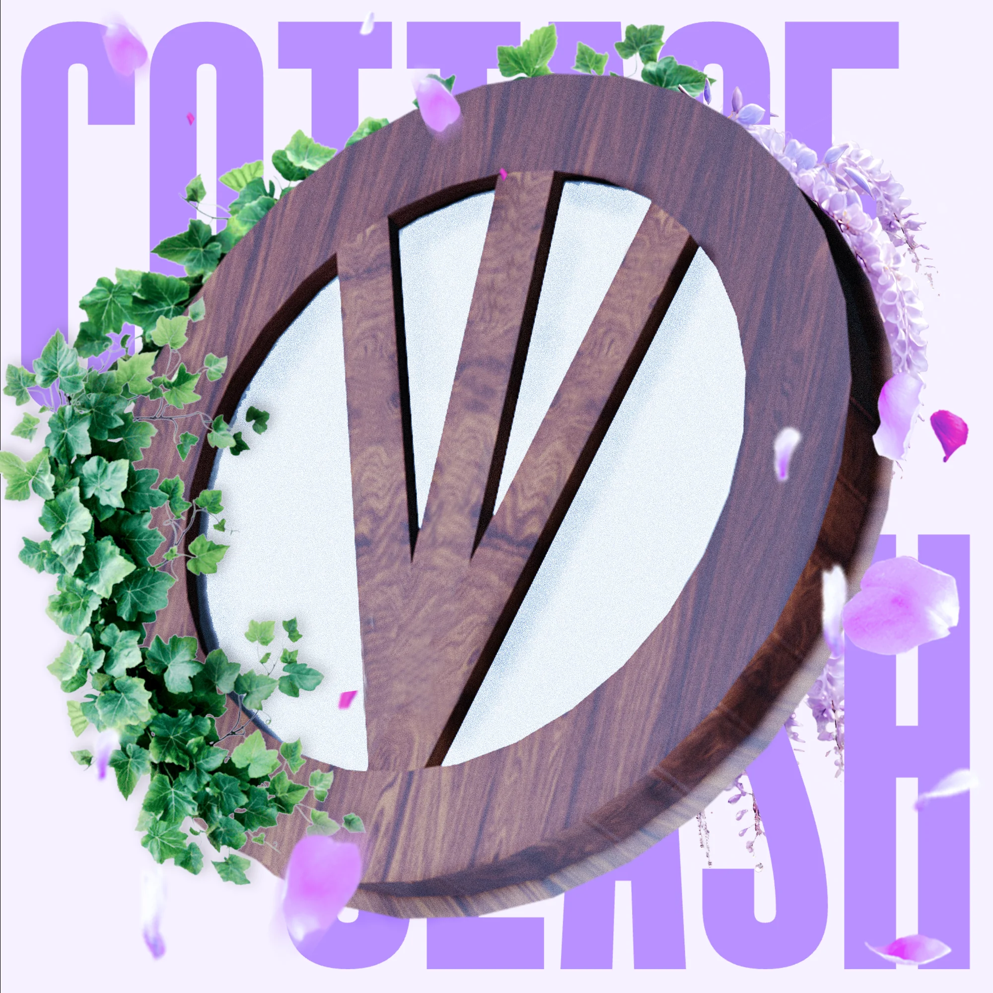
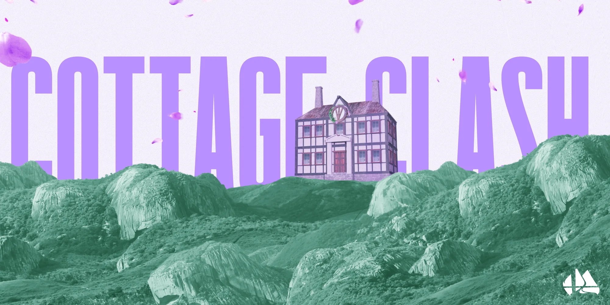
Worked closely with other players within the region that wanted to run their own tournaments. Maintaining consistency across events, whether it was public or an invitational.
The Outcome
Boone Smashes became a larger, more competitive and more professional scene. New venues like Kovu’s Coffee and a Plemmons Student Union partnership raised student play, and the organization now presents professionally to players, sponsors and other regions.
Community Growth
Tristan’s creativity and artistic flare have dramatically improved the Boone NC Smash Bros Community. Through his works a large portion of our community strives to improve for just a chance to appear on his designs. Year after year he has improved by incorporating new skills such as 3D modeling, typography, and dynamic composition.
Player Incentive
Tristan’s creative and high quality graphics are a large part of why players want to compete. The chance to make it on to the custom top 8 graphic each week is a big incentive for players to attend and try to do well enough to be featured.